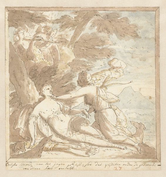
drawing, paper, watercolor
#
drawing
#
baroque
#
figuration
#
paper
#
watercolor
#
coloured pencil
#
history-painting
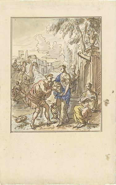
Dimensions: height 211 mm, width 180 mm
Copyright: Rijks Museum: Open Domain
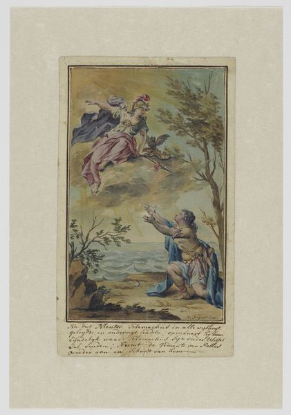
Editor: Here we have "Hercules at the Crossroads," a watercolor and ink drawing on paper by Elias van Nijmegen, dating roughly from 1677 to 1755. It depicts Hercules in a landscape with two women. The muted color palette lends a somewhat dreamlike quality to the scene. How do you interpret the composition of this work? Curator: Intriguing. The piece strikes me through its strategic deployment of line and color. Note how the artist utilizes the linear structure of the trees and figures to create a dynamic diagonal, moving from left to right. The choice of watercolor offers a luminosity but also a subdued effect that undercuts any sense of grandiose spectacle often associated with Baroque art. Consider the significance of this delicate medium, in contrast to the heroic theme it engages. Do you see how the coloration, specifically the contrast between the muted earth tones of Hercules and the brighter blues and pinks of the female figures, dictates the spatial relationship between the foreground and background? Editor: Yes, I see that. It almost creates a visual hierarchy, separating Hercules from the temptations he faces. The color really emphasizes the weight of his decision. Curator: Precisely! Further, observe how Nijmegen employs a structural binary. On one side, shadowed contemplation; on the other, radiant temptation. Note, too, how light refracts within the watery pigment, creating gradients of hue that direct the eye to pivotal points of conflict. Is it the path bathed in light the protagonist shall embrace, or does the earth-toned hue to his left hold his future? Editor: I never noticed that interplay between color and the narrative itself. I had thought of color simply as adding detail, but now I see that it drives the story. Curator: Exactly. By examining formal qualities—color, line, composition—we decipher narrative choices. Form is not merely decorative; it *is* the language of visual art. What at first appeared muted is a calculated deployment of media designed to illuminate interior psychological conflict. Editor: Thank you. Looking at the piece now, the subdued colors seem less muted, more deliberate.
Comments
No comments
Be the first to comment and join the conversation on the ultimate creative platform.
More like this