drawing, paper, watercolor, ink
#
drawing
#
allegory
#
baroque
#
landscape
#
figuration
#
paper
#
watercolor
#
ink
#
genre-painting
#
watercolor
Dimensions: height 199 mm, width 190 mm
Copyright: Rijks Museum: Open Domain
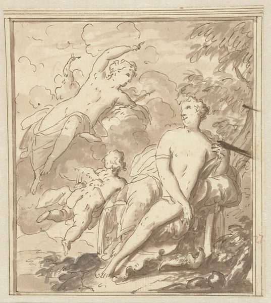
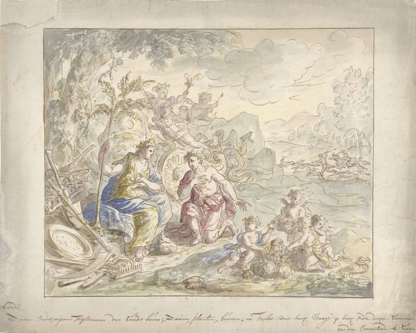
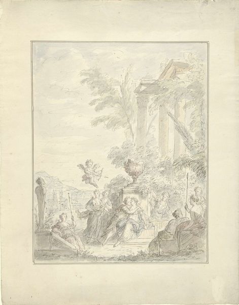
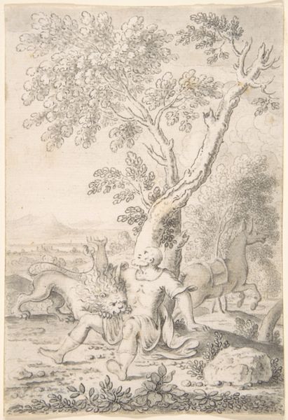
Editor: This artwork is "Jupiter en Callisto," dating from between 1680 and 1757, by Mattheus Terwesten. It’s done in ink, watercolor, and possibly other media on paper, and it's currently at the Rijksmuseum. The colors are soft, almost faded, and the figures are gracefully posed. How do you interpret this work, considering its composition? Curator: Observe how Terwesten employs line and wash to create depth and volume. The composition guides the viewer’s eye from Callisto, reclining in the foreground, toward the dramatic figures in the background, seemingly Jupiter disguised as Diana. The diagonal recession adds a sense of dynamic movement, a hallmark of Baroque aesthetics. The limited color palette enhances the sense of antiquity. Editor: So you're focusing on the structure, rather than the story being depicted? Curator: Precisely. Note how Terwesten’s rendering of the figures’ drapery. How does the rendering and treatment contribute to the overall visual impact? Editor: I see how the fluid lines of the clothing emphasize the contours of the figures, creating a sense of movement and tension. But without understanding the narrative, are we missing a layer of meaning? Curator: The narrative, of course, contributes context. However, formalism prioritizes how the artist communicates meaning through the inherent visual elements. It's about dissecting the language of art itself. Editor: That makes me consider art's visual qualities independently. I now better appreciate how lines, composition, and color create this artwork's unique experience, not solely the mythology behind it. Curator: Yes, a shift from subject to its formal qualities unveils an entirely new lens through which we appreciate Terwesten's art.
Comments
No comments
Be the first to comment and join the conversation on the ultimate creative platform.
More like this