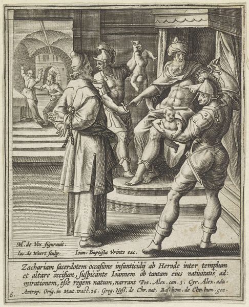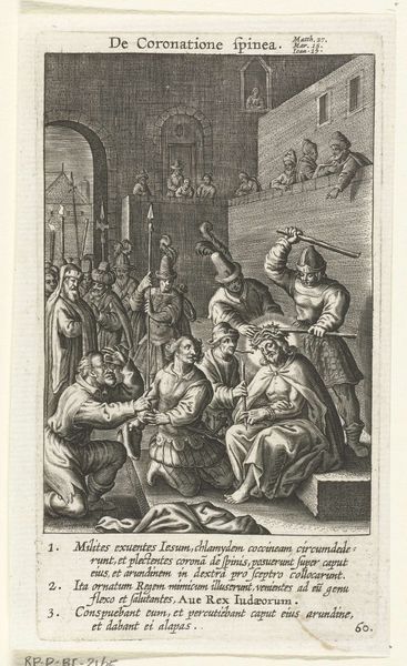
Curatorial notes
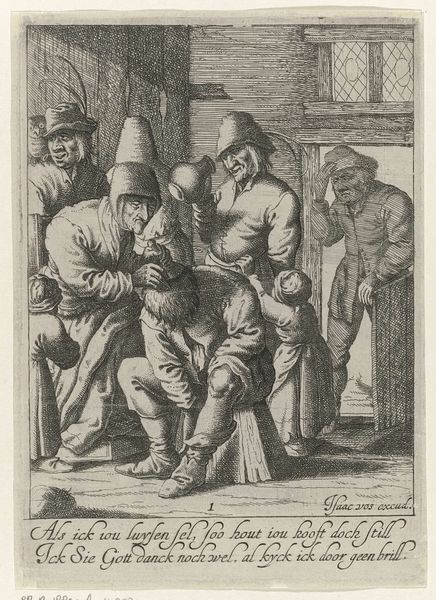
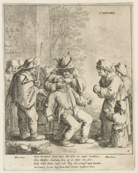
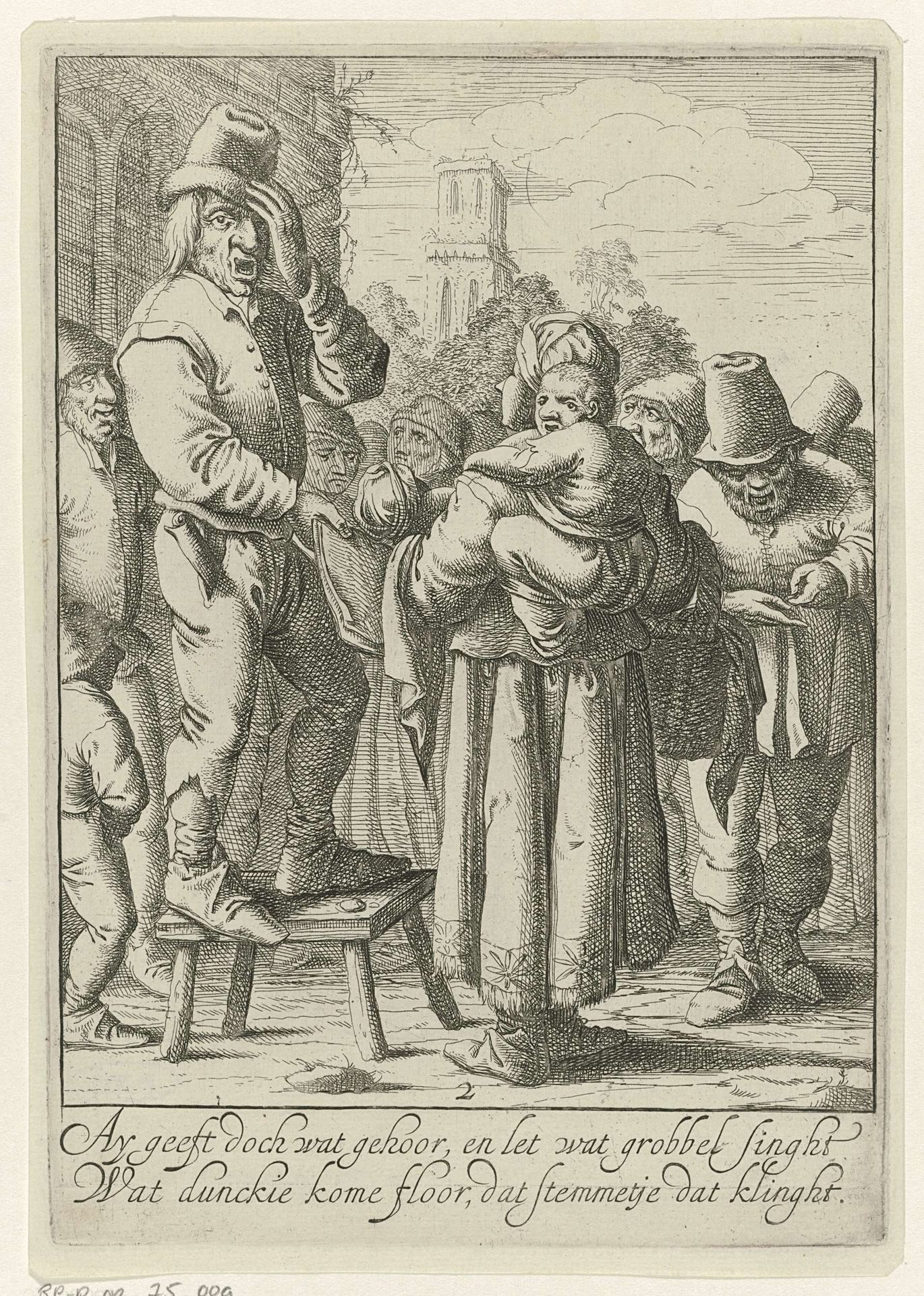
Editor: This engraving, *Gehoor,* which translates to "Hearing," is estimated to have been created between 1640 and 1670, placing it firmly in the Dutch Golden Age. The scene depicts a figure elevated on a stool, seemingly addressing a crowd. It feels almost theatrical in its composition, but there’s something unsettling about the expressions on the faces. What do you see in this piece, looking at it through a symbolic lens? Curator: Immediately, I am drawn to the performative nature, not simply of the central figure on the stool, but of the crowd itself. Notice how their postures seem almost like exaggerated embodiments of listening, or perhaps a *lack* thereof? Consider the symbolism of the stool, an object of unstable elevation – a raised position that’s far from secure. Is the speaker genuinely heard, or merely observed? Think of how hearing has been depicted across different times. What iconographies are present here? Absent? Editor: That’s interesting. The figures in the background, particularly the one with the child, seem to represent a sort of contained chaos, almost deliberately out of sync with the speaker’s presumed message. It makes me wonder about the cultural memory associated with public oration in this period. Curator: Precisely! And that interplay of order and chaos extends to the details. The dress, posture, and facial characteristics create visual tension and can teach us how visual shorthand informed the collective understanding during that time. The inscription adds another layer. Let's consider how the typography may contribute to or even disrupt the intended symbolic reading of the image. How does its integration play into the scene's broader narrative? Editor: I never thought of the lettering as being deliberately placed to disrupt things. I had assumed it was informational. Thanks for making me rethink my initial assumptions. Curator: The beauty lies in re-evaluation, finding new resonances as we learn. The true genius is considering not only the intended symbolic weight but the multiple readings that time and culture imbue.