#
script typography
#
hand-lettering
#
old engraving style
#
hand drawn type
#
hand lettering
#
personal sketchbook
#
hand-drawn typeface
#
pen work
#
sketchbook drawing
#
sketchbook art
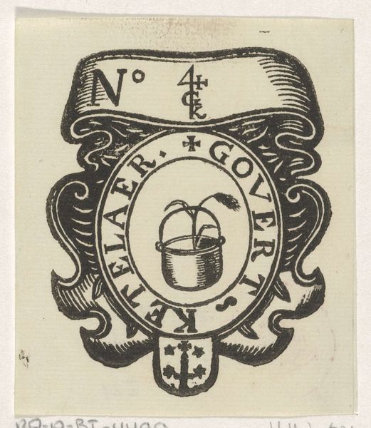
Dimensions: height 47 mm, width 115 mm
Copyright: Rijks Museum: Open Domain
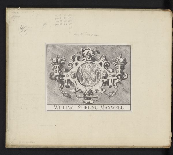
Editor: Here we have Mathieu Lauweriks' business card from 1897. It's a beautifully designed piece of typography, all hand-lettered, with a distinct, almost architectural feel. The symmetry is really striking. What jumps out at you when you see this card? Curator: The context! Lauweriks was part of a fascinating period where art, architecture, and design were converging. This card isn't just an identifier; it’s a statement. It speaks to the rising status of graphic design, wouldn't you agree? The stylized elements and handcrafted lettering, moved design closer to art, legitimizing its value. Editor: Absolutely. The geometric patterns and that cross shape in the middle also feel pretty significant. What could those be referencing? Curator: The cross hints at spiritual and philosophical leanings common in the late 19th century, and very indicative of Lauweriks work. Many artists explored theosophy and symbolism. Look at the card again: does the arrangement remind you of anything? Editor: Now that you mention it, the whole design does remind me a lot of stained glass windows. It gives a sense of purpose to this work. Curator: Precisely! By framing his identity with symbolic and sacred motifs, Lauweriks elevated the simple act of exchanging contact information to express a broader mission, wouldn't you say? Editor: That's a perspective I hadn't considered before. It’s more than just a name; it’s a declaration of his artistic ethos. Thanks for pointing that out. Curator: The beauty of art is discovering these connections. It holds so much social significance. It makes me look at my business cards with much more careful intention.
Comments
No comments
Be the first to comment and join the conversation on the ultimate creative platform.
More like this