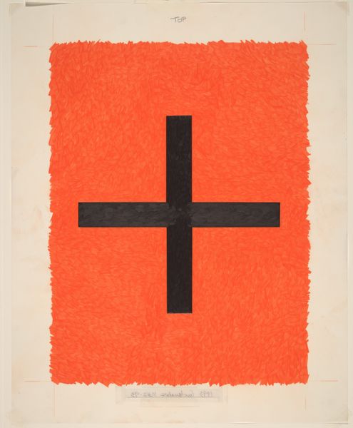
painting, acrylic-paint
#
symbol
#
painting
#
postmodernism
#
acrylic-paint
#
figuration
#
cross
#
geometric
#
pop-art
#
line
Copyright: Patrick Caulfield,Fair Use
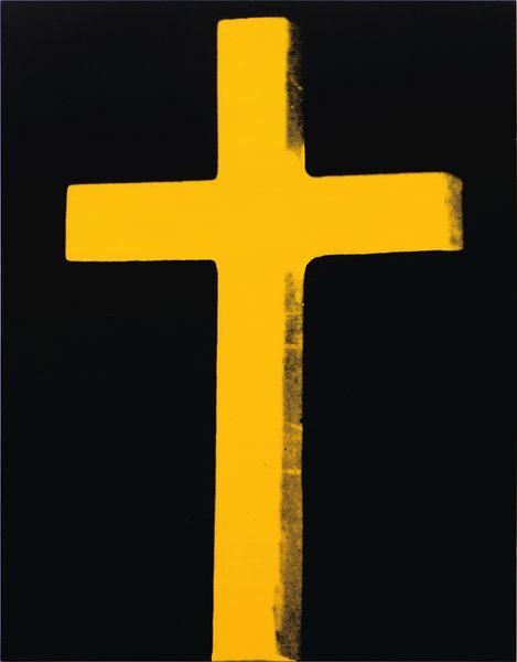
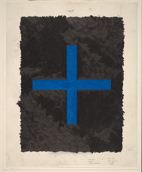
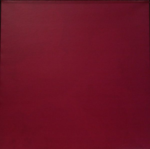
Editor: Patrick Caulfield’s “Cross,” painted in 1968 with acrylic, strikes me as deliberately simplistic. The stark red background and cartoonish lines feel so detached from the gravity one might expect from such a loaded symbol. How do you interpret this work? Curator: Caulfield, very much a product of his time, played with Pop Art aesthetics and the postmodern unease surrounding traditional symbols. Think about the cultural landscape of the late 60s: established institutions were being questioned, traditional values were being challenged. How do you see this translated into the visual choices Caulfield makes? Editor: I guess by stripping the cross of any detail or realistic shading, and placing it against this vibrant, almost abrasive, colour, he is challenging the traditional reverence associated with it? Almost like mass-producing faith? Curator: Precisely. Consider the role of museums and galleries then. Pop Art democratized art, making it more accessible, blurring the lines between "high" and "low" culture. By depicting the cross in such a graphic and impersonal manner, Caulfield makes the viewer question their own relationship to established symbols and their meanings. Does the seemingly detached style heighten or diminish the impact, in your opinion? Editor: It’s strange. I think it might do both. It makes it less obviously emotive, more clinical almost, which forces you to confront the symbol in a different way. It's thought-provoking. Curator: Agreed. And that's often the power of art rooted in socio-political observation. It’s not necessarily about offering answers but prompting critical engagement. It highlights the public role of art and the politics inherent in any form of imagery. Editor: It’s given me a whole new way to look at it. Thanks.
Comments
No comments
Be the first to comment and join the conversation on the ultimate creative platform.
More like this