Dimensions: height 184 mm, width 251 mm
Copyright: Rijks Museum: Open Domain
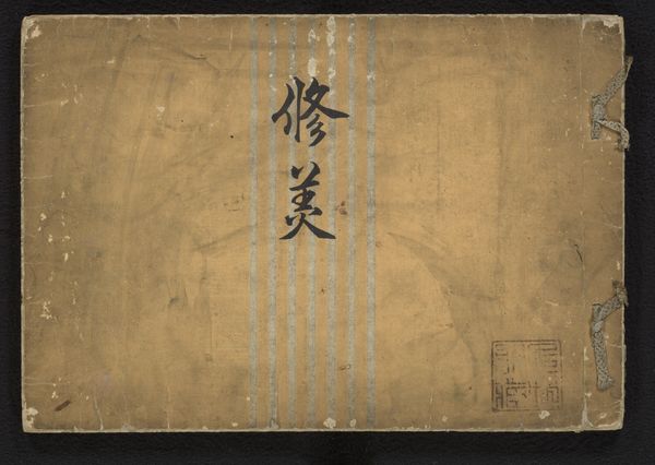
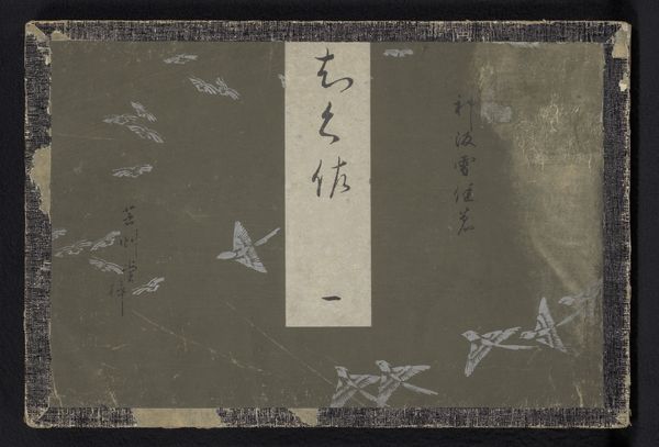
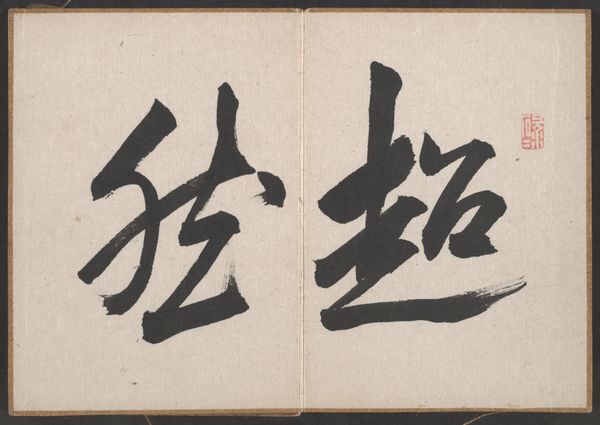
Editor: This is "Bloemrijke ontwerpen", or "Floral Designs," made between 1905 and 1908 by Furuya Korin. It's a print on paper, and what immediately strikes me is how the grid pattern contrasts with the free-flowing calligraphy in the center. How do you interpret this interplay of structure and spontaneity? Curator: The relationship between the grid and the calligraphy establishes a fundamental dichotomy. Notice how the rigidity of the squares, achieved through careful registration in the printing process, is intentionally juxtaposed against the fluid, almost organic quality of the brushstrokes. Do you perceive a visual hierarchy being created through this contrast? Editor: Yes, the calligraphy definitely pops out, becoming the focal point against the more subdued grid. Is the grid merely a background, or does it serve a deeper structural purpose within the composition? Curator: It's more than just background. The grid acts as a formal constraint, a visual scaffolding upon which the calligraphy performs. The imperfection of the aging process – the uneven discoloration of the paper, the slight misalignments within the grid – introduce an element of chance and imperfection. This echoes, in a very subtle way, the organic nature of the calligraphic forms. Do you see how the materiality of the piece enhances its conceptual framework? Editor: I do. The texture of the aged paper and slight imperfections almost feel intentional, creating a harmony between the rigid and organic. Curator: Precisely. The artwork finds its strength not just in the juxtaposition of these elements, but in the way it brings structure and seeming chaos into conversation. Editor: I see it now, how the material quality really speaks to the intent of the whole composition! Thank you!
Comments
No comments
Be the first to comment and join the conversation on the ultimate creative platform.
More like this