#
aged paper
#
homemade paper
#
paper non-digital material
#
paperlike
#
paper texture
#
personal sketchbook
#
hand-drawn typeface
#
thick font
#
letter paper
#
historical font
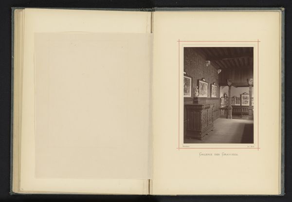
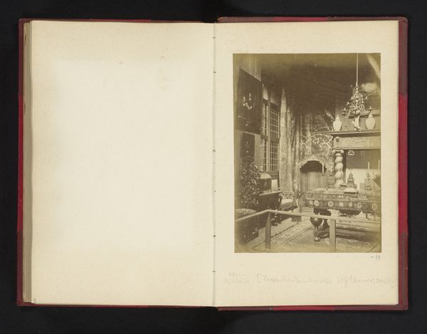
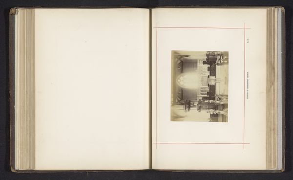
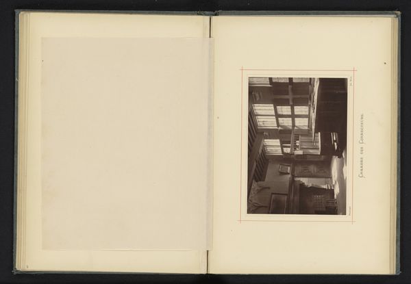
Dimensions: height 163 mm, width 118 mm
Copyright: Rijks Museum: Open Domain
Curator: This work, titled "Interieur van de vergaderzaal in het huis van Christoffel Plantijn", gives us a peek inside the Plantin-Moretus Museum, famed for its printing legacy. The photograph itself was taken before 1878 by Joseph Maes. What are your initial thoughts? Editor: Well, my first impression is a somber stillness, a near-sepulchral quality, in no small part thanks to its near monochrome character. The single, heavy table anchors the whole composition. Curator: It definitely has an air of quiet dignity. The Plantin family were incredibly influential humanists and publishers, and their home was at the heart of intellectual life in Antwerp. I can imagine crucial decisions being made around this table. Do you notice any interesting details in its structure or aesthetic? Editor: Indeed! Note how the tabletop's pronounced horizontal directs the eye through the scene, terminating at the ornate mantle, with only the intricate chandelier above daring to oppose the otherwise unyielding planar perspective. The visual emphasis on stability here creates a palpable sense of order. Curator: Absolutely. It speaks volumes about the Plantin's values of clarity and control in the burgeoning printing industry. We’ve had a recent comment calling for discussion of font – have you anything to note on the lettering present on this page? Editor: Yes, there are some qualities that suggest the font has been created by hand – see how ‘Salle de la Direction’ is printed using something closely resembling hand-drawn typeface. Even the borders are irregular, almost to resemble letter paper edges. This reinforces that visual impression of having chanced upon a historical document in situ. Curator: Very perceptive. That blend of grandeur and painstaking work reflects the spirit of the printing house and its founder so aptly. Is it perhaps meant to evoke ideas of family history or corporate lineage in this manner? Editor: Certainly, there is perhaps more than a hint of romantic historicism; its creator likely intended to venerate the virtues of the venerable company, rather than deliver an accurate and true record of events. It serves as a visual analogue to Plantijn's legacy – steadfast, organized, but touched by the individual artistry of the family themselves. Curator: That is an interesting angle on it to round it off. It reminds me how carefully constructed and enduring images carry such immense cultural weight. Thank you for that insightful observation!
Comments
No comments
Be the first to comment and join the conversation on the ultimate creative platform.
More like this