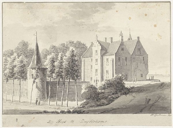
drawing, ink, pencil
#
architectural sketch
#
drawing
#
aged paper
#
light pencil work
#
quirky sketch
#
baroque
#
pencil sketch
#
old engraving style
#
landscape
#
personal sketchbook
#
ink
#
sketchwork
#
pen-ink sketch
#
pencil
#
cityscape
#
initial sketch
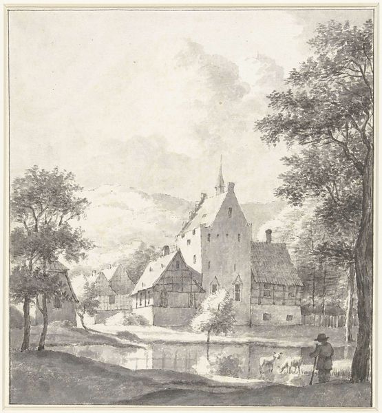
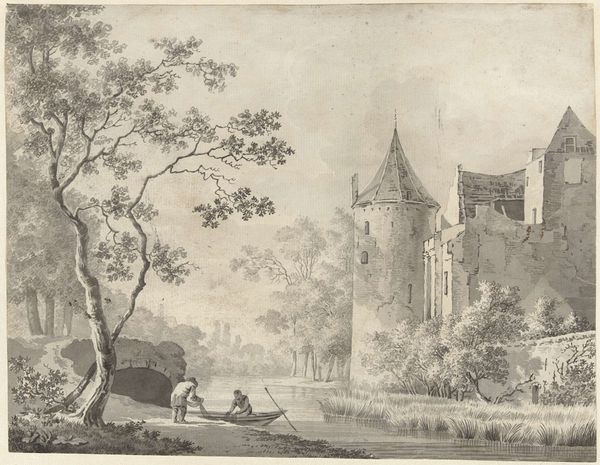
Dimensions: height 120 mm, width 178 mm
Copyright: Rijks Museum: Open Domain
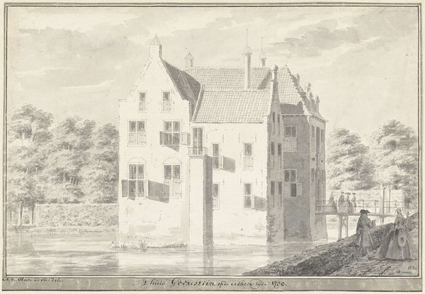
Editor: This is "Het Huis Killenstein," a pen, ink, and pencil drawing made sometime between 1717 and 1748 by Abraham de Haen the second, currently held at the Rijksmuseum. I’m struck by the texture of the paper and the detailed lines used to create the composition. It feels very delicate. What do you see in this piece, focusing on its structure? Curator: Initially, the architectural elements present a complex interplay of geometric forms. Notice the acute angles of the rooftops juxtaposed against the more stable, rectangular facades. The fenestration creates a visual rhythm, guiding the eye vertically and horizontally across the structure. How does the use of line contribute to your experience of the drawing? Editor: I think the varied line weights suggest depth and shadow, particularly around the windows and rooflines. The thin, almost ephemeral lines in the water give it a sense of movement, contrasting with the bolder, more defined lines of the buildings. Does the materiality influence its presence, its impact? Curator: Absolutely. The deliberate use of aged paper grants the drawing an ethereal quality. The texture acts as a crucial compositional element, heightening the contrast of the pen strokes. This patina both unifies the forms while highlighting subtle ruptures or shifts in application, a tension that serves to reinforce the drawing's delicate but enduring nature. Consider, too, how the lack of vibrant coloration directs attention to the relationships between tone, line, and form. Editor: That's a really interesting point. I was so focused on the subject, I didn’t really consider how the materials impacted its meaning. Thanks! Curator: Indeed. Analyzing those artistic components helps expose the very structures by which meaning occurs. A fruitful analysis!
Comments
No comments
Be the first to comment and join the conversation on the ultimate creative platform.
More like this