drawing, paper, ink
#
drawing
#
organic
#
art-nouveau
#
paper
#
form
#
ink
#
linocut print
#
geometric
#
abstraction
#
line
#
decorative-art
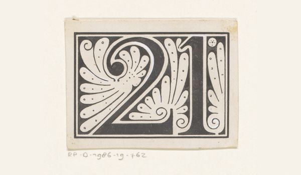
Dimensions: height 50 mm, width 70 mm
Copyright: Rijks Museum: Open Domain
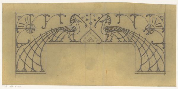
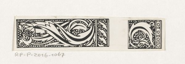
Editor: This is *Getal 29*, a drawing created by Reinier Willem Petrus de Vries in 1904, using ink on paper. I find the high contrast and repeating motifs rather mesmerizing. What catches your eye, and how might you approach interpreting its meaning, or its function? Curator: Intriguing. Initially, one is struck by the dichotomy of the monochrome palette. Note how de Vries employs line—thick, curvilinear strokes against thin, straight edges. These aren't just decorative; they define and confine the negative space, thus shaping the form itself. It's a sophisticated interplay. Do you perceive how the composition isn't simply symmetrical, but instead utilizes a sort of radial balance emanating from that central '29' form? Editor: Yes, I see it now. It's almost like a stylized, organic emblem, built from numbers. Curator: Precisely. Consider how this work engages the discourse of Art Nouveau. While seemingly representational, observe how the drawing pulls away from direct representation towards something more abstract, more concerned with the qualities of line, form and balance. How the numerical form relates to this impulse is, perhaps, where the intrigue lies. Editor: It's less about what it *is* and more about how the formal elements come together. Curator: Precisely. And understanding that relationship between form and medium grants insight. We appreciate the essence of this, and other works. Editor: I see what you mean! It changes my perspective a little, thinking about it terms of formal relations rather than representational meaning. Curator: Indeed. Looking closely, one begins to perceive the meticulous care put into line and shape; how those shapes organize the visual field for the eye, and engage its perception.
Comments
No comments
Be the first to comment and join the conversation on the ultimate creative platform.
More like this