acrylic-paint
#
abstract-expressionism
#
pattern
#
pop art
#
acrylic-paint
#
geometric pattern
#
abstract pattern
#
geometric
#
geometric-abstraction
#
pop-art
#
hard-edge-painting
Copyright: Richard Mortensen,Fair Use
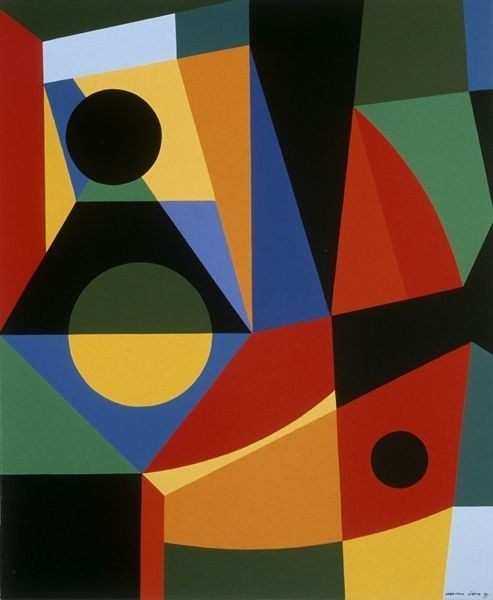
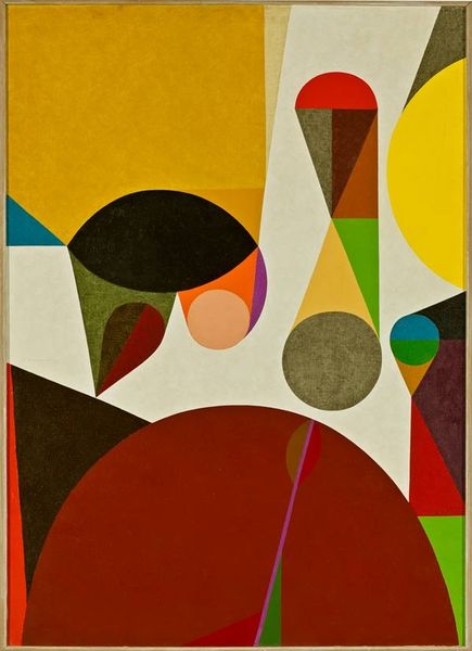
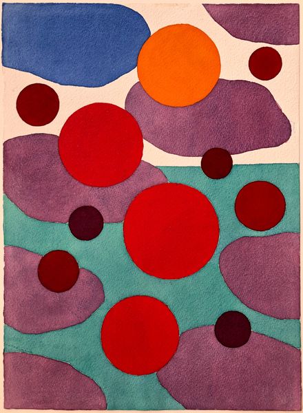
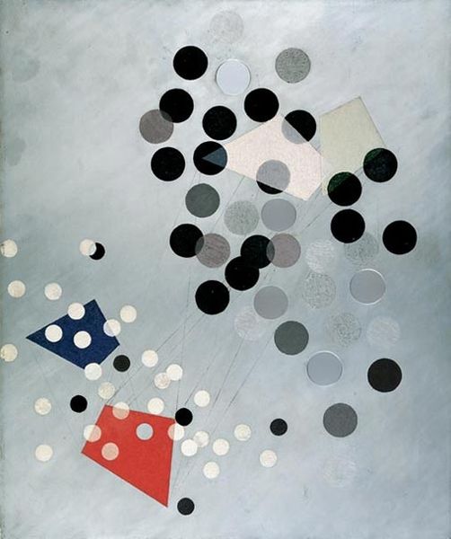
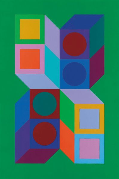
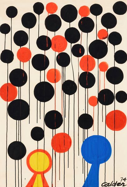
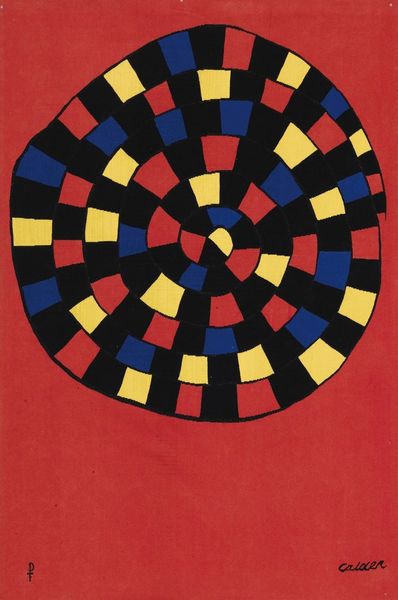
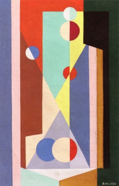
Editor: We’re looking at Richard Mortensen's "Ominenda" from 1963, an acrylic on canvas. It strikes me as playfully rigid, almost like a geometric game board. The contrasting circles and the turquoise structure are…unsettlingly cheerful. What do you make of it? Curator: Playfully rigid…I love that! It resonates, doesn't it? Mortensen was deeply influenced by geometric abstraction, but he wasn't afraid to let the shapes breathe, to give them a sort of…quirky personality. Think about it: the hard-edged turquoise form clashing with those seemingly scattered circles. Are they floating? Are they pinned? Is there any implied movement? It teases the eye. What do those colour pairings evoke for you? Editor: Hmmm... Tension, definitely. The colours feel very deliberate, almost like a code. Like they're trying to communicate something, but I can't quite grasp what. Curator: Exactly! It is a code…a personal visual language. Mortensen wanted us to feel the tensions inherent in the modern world. Think about it: that controlled geometry against the almost rebellious freedom of colour. He wanted you to feel that friction in your bones! It makes you question where control and chaos meet, doesn’t it? Editor: Absolutely. It's far more complex than it initially seems. The piece felt light at first, but it's a really thought-provoking exploration. Curator: Isn't that the joy of art? To look, to feel, and to have the world rearranged in your head? Mortensen gives us permission to ask these unanswerable questions. So lovely!
Comments
No comments
Be the first to comment and join the conversation on the ultimate creative platform.
