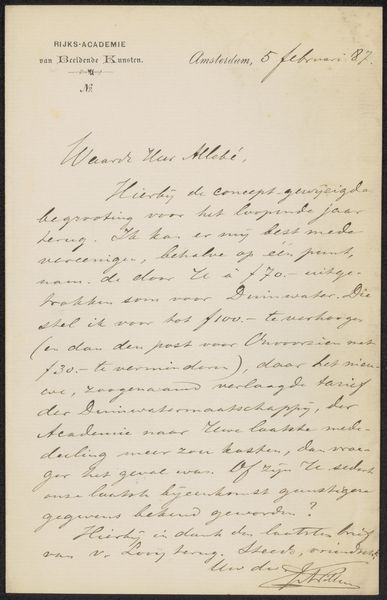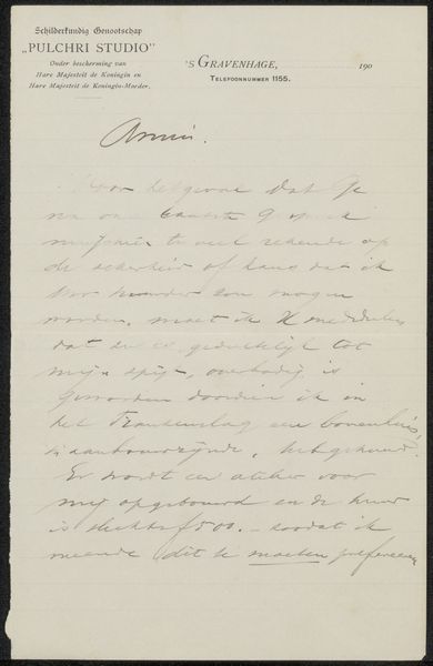
drawing, paper, ink
#
drawing
#
paper
#
ink
Copyright: Rijks Museum: Open Domain
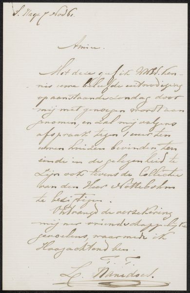
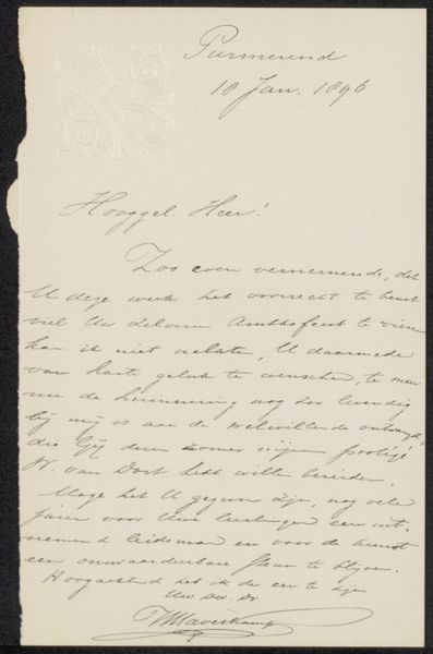
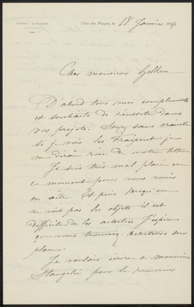
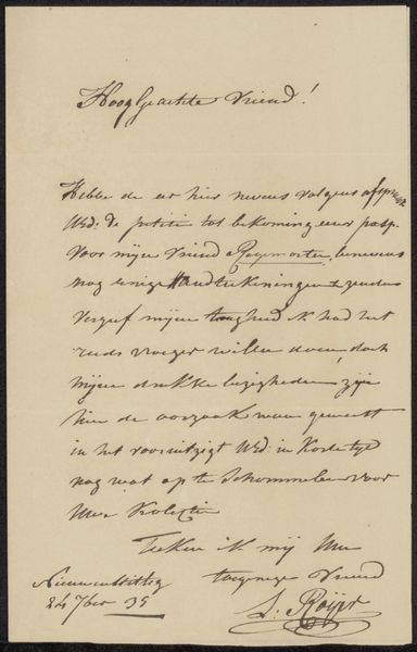
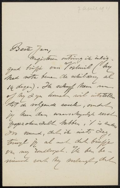
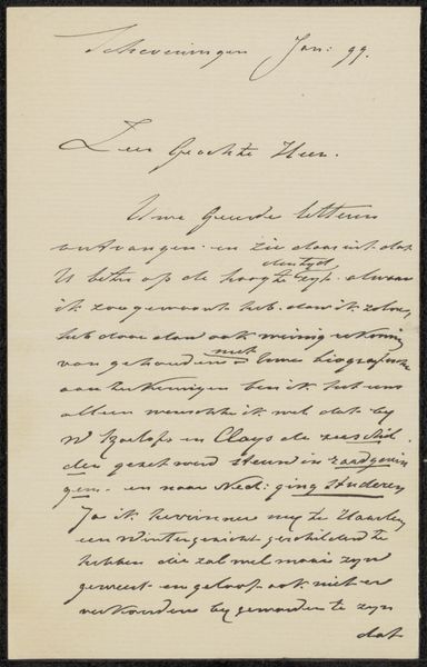
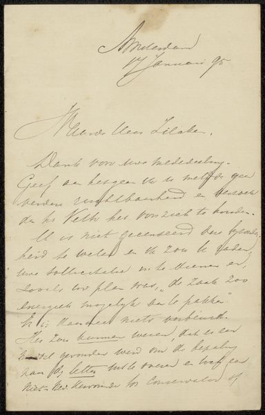
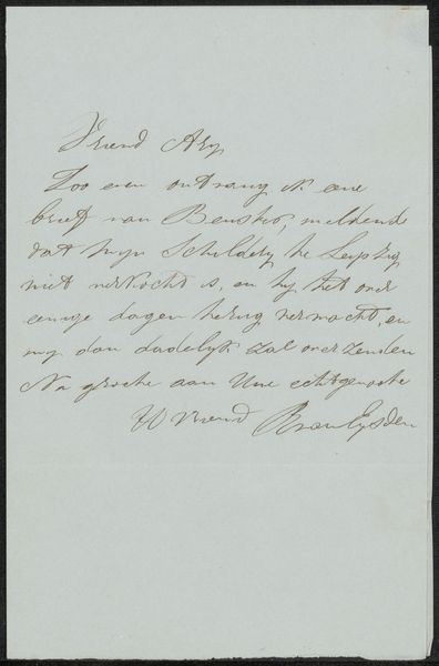
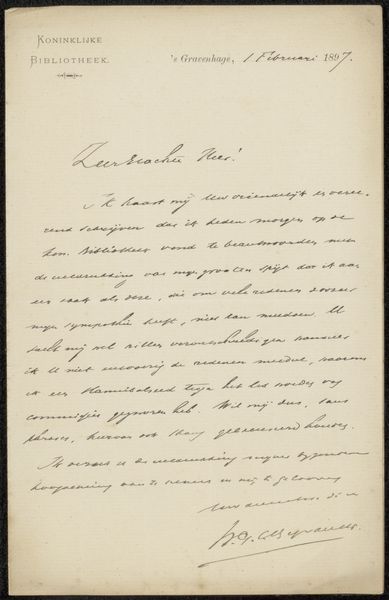
Editor: This is "Brief aan Wally Moes" by Bartholomeus Lambertus Voskuil, probably from between 1901 and 1904. It's an ink drawing on paper. It's interesting how the text is so prominent; it almost feels like the words themselves are the subject. What's your take on it? Curator: From a formalist perspective, it’s compelling to examine the interplay between the visible, tangible ink and the void of the paper. The curvilinear shapes of the script create a dance across the page. Notice how the ascenders and descenders punctuate the otherwise even texture. Does that contrast spark a visual interest, perhaps even a rhythmic cadence as you follow the lines of text? Editor: I see what you mean about the rhythm. So, even though it's a letter, you're seeing it more as a collection of shapes and textures, rather than the message it's conveying? Curator: Precisely. The semantic content, while undoubtedly present, takes a backseat to the aesthetic qualities of the handwritten script itself. How does the specific weight and pressure of the ink application contribute to your overall experience of the piece? Do you perceive any variance or pattern within the writing? Editor: I think I notice heavier ink in the flourishes of the cursive...it adds some emphasis, or a focal point within the lines. Curator: An astute observation. These subtle variations serve to further activate the surface, imbuing it with a certain dynamism. Perhaps you agree the materiality itself becomes the artwork. Editor: That’s a different way of seeing a letter. Focusing on the visual qualities over the text is something I hadn’t considered. Curator: Indeed. Examining the formal elements allows us to appreciate art in ways we might not have initially recognized.
Comments
No comments
Be the first to comment and join the conversation on the ultimate creative platform.
