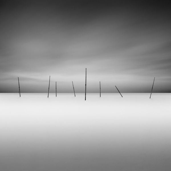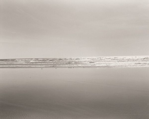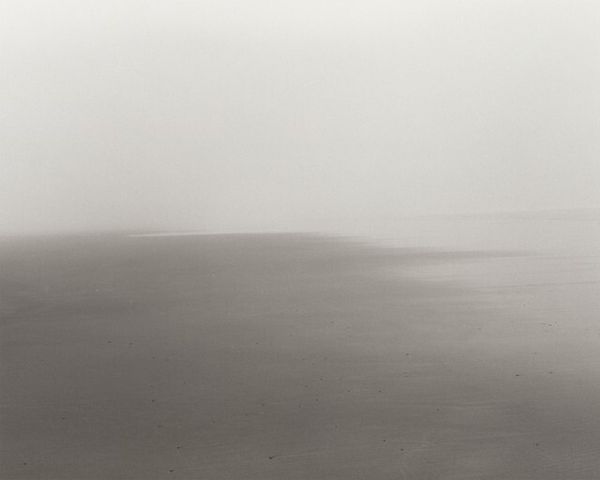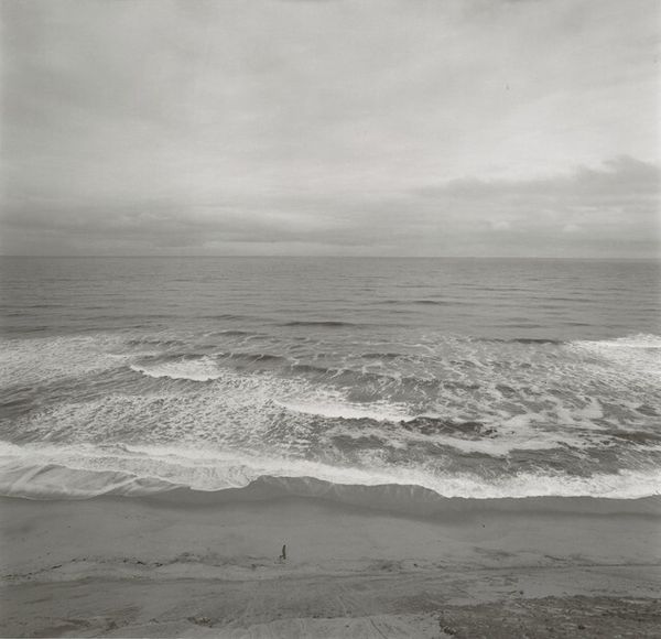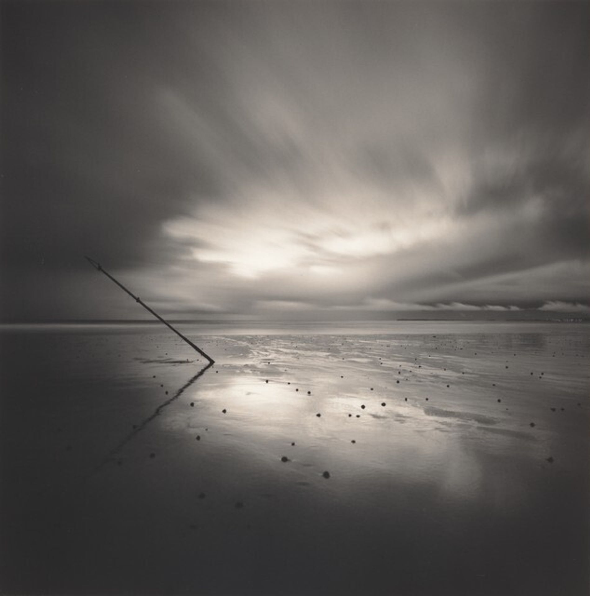
1997
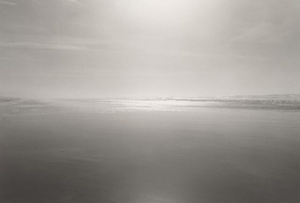
Points East, Pendine Sands, Wales
Listen to curator's interpretation
Curatorial notes
Editor: This is Michael Kenna’s "Points East, Pendine Sands, Wales," a gelatin silver print from 1997. It's quite striking. The monochrome and the long exposure of the clouds make the image almost dreamlike. There's this strong diagonal line of what seems to be a post or a stick, stuck into the sand, creating a stark contrast against the softness of the sky and beach. What do you see in this piece? Curator: It is the stark interplay of light and shadow that commands attention. Note how Kenna harnesses tonality to delineate form and texture. The deliberate contrast serves to intensify the visual experience. It brings focus to the geometrical solidity of the pole set against the sweeping and atmospheric fluidity of the clouded sky. Can you see how the tonal distribution contributes to a flattening of perspective? Editor: I see what you mean. The heavy clouds and the flat, reflective beach sort of compress the space. It's like the image is less about depth and more about the textures and shapes. How does the composition play into that? Curator: The careful compositional arrangement further underscores the interplay of natural and structured form. Consider the rule of thirds – note that it has been avoided, instead allowing for a balance in tonal weight with the shadowed areas grounding the photograph, contrasting with the luminous sky. Ask yourself what that disruption achieves here? The pole acts as a key element, positioned off-centre. Editor: That's true. The pole isn't perfectly centered, it’s deliberately placed to the left which creates an asymmetry which feels very deliberate. I wonder if that intentional off-balance is meant to create some sense of visual tension. Curator: Precisely. What do you suppose the smooth tonal gradations of monochrome elicit? Editor: I think it simplifies the image to its basic forms and creates an atmosphere. It feels more timeless than a colour photograph would. Curator: Yes, quite. Monochrome abstracts the real. Stripped of hue, one apprehends fundamental relations more directly. The work is successful in engaging in this sophisticated exercise in seeing. Editor: It is so interesting how focusing on the composition and tonal quality transforms the artwork. Thank you. Curator: It has been a pleasure to see it with you.