drawing, print, paper, ink, pen, engraving
#
portrait
#
drawing
#
neoclassicism
# print
#
pen sketch
#
paper
#
ink
#
pen-ink sketch
#
pen
#
watercolour illustration
#
genre-painting
#
engraving
Copyright: Rijks Museum: Open Domain
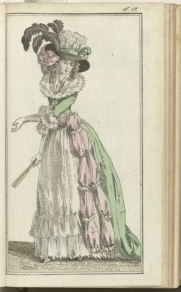
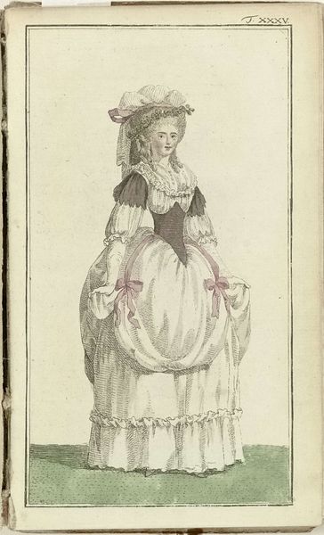
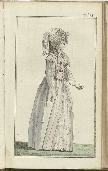
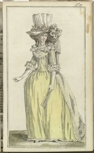
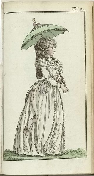
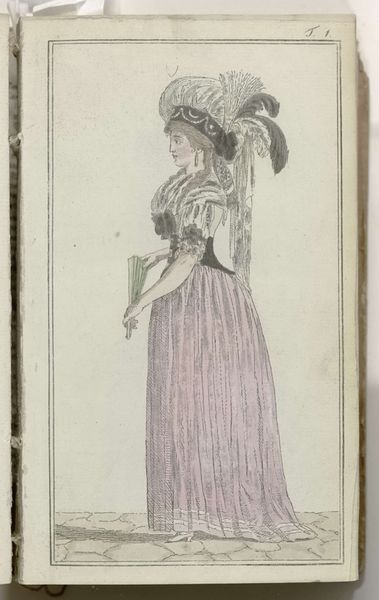
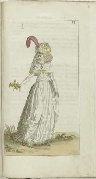
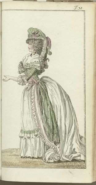
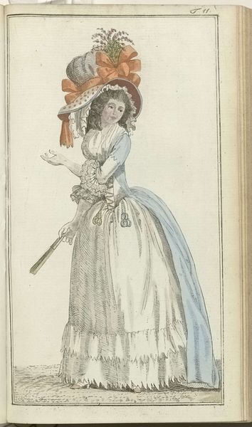
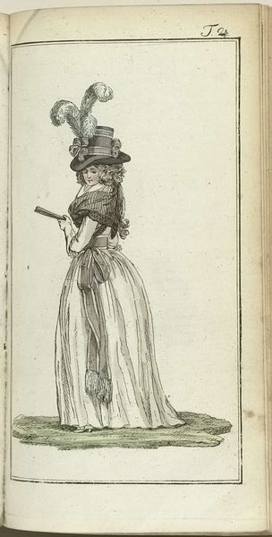
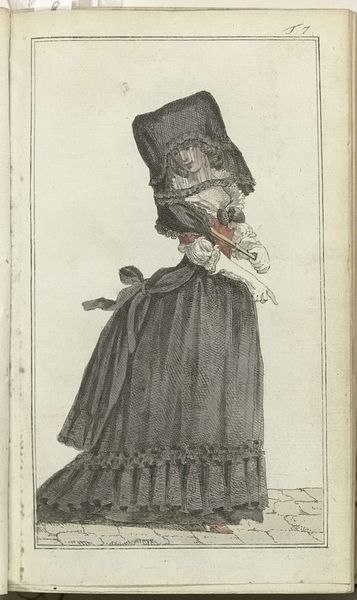
Curator: Let’s discuss "Journal des Luxus und der Moden 1788, Band III, T.25," created in 1788 by Friedrich Justin Bertuch, rendered in ink and watercolor on paper, with engraving elements. What's your immediate take on this piece? Editor: Restrained but exuberant, if that makes sense. It feels poised, almost… calculated in its visual presentation. It feels like a carefully curated performance of femininity, power, and wealth. What is the deeper purpose behind an image like this? Curator: Note how the precise linework of the ink defines the form and then layered watercolor fills evoke a very pleasing overall image. The print exhibits characteristics consistent with the prevailing aesthetic norms of the time, notably in its employment of line and color, as well as neoclassical design. The structure relies upon symmetry. Editor: Absolutely, the lines do convey neoclassical structure, but for whom was this made, and what sort of space did it occupy? Periodicals like this acted as vehicles that bolstered consumerist ideals; it certainly raises questions about class and accessibility. Did its influence perpetuate restrictive gender norms? Curator: I think focusing on the image’s presentation is critical. Observe how Bertuch has constructed the figure and rendered it through various deliberate choices to communicate something, maybe the stylish cut of the fabric or the careful placement of details—the ribbons and bows, the lace, the strategically employed striping on the dress. Editor: But let's think critically about that visual presentation. These fashionable pieces acted as signifiers of belonging—a very potent image about power relations during an era rife with revolution. What effect might these images have had on marginalized people unable to access luxury and power in the same ways as their wealthier contemporaries? What kind of world did it imagine, and who did it exclude? Curator: I recognize those interpretations, but I contend that by emphasizing the materials—the ink, paper, watercolor, and engraving techniques, that it stands alone as a technical masterpiece and its enduring appeal lies in the successful manipulation of artistic materials and design principles. Editor: Agreed! Examining the structural elements yields a compelling glimpse into the artistry of that period and considering the social milieu gives me a lot to reflect on regarding historical and contemporary culture. Curator: Exactly, analyzing artistic structure while exploring the relationship between this printed image and cultural expression truly heightens its resonance for modern audiences.
Comments
No comments
Be the first to comment and join the conversation on the ultimate creative platform.
More like this