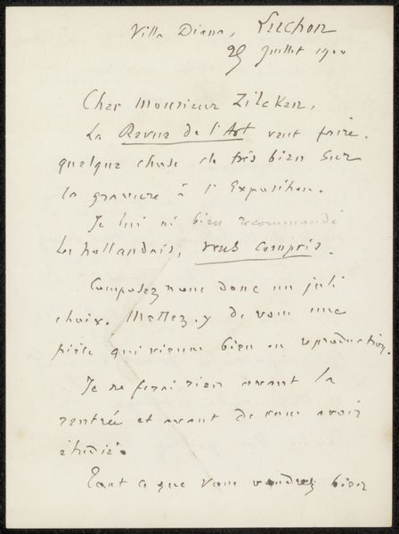
drawing, paper, ink, pen
#
drawing
#
pen drawing
#
pen sketch
#
paper
#
ink
#
pen
Copyright: Rijks Museum: Open Domain
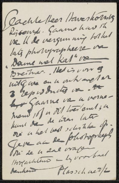
Editor: We're looking at "Brief aan Pieter Haverkorn van Rijsewijk," a pen and ink drawing on paper by Isaac Israels, created sometime between 1875 and 1915. It feels… intimate, almost fragile, in its stark simplicity. What do you see in it, beyond the obvious handwritten script? Curator: The aesthetic lies precisely in that script. Note how the variations in line weight create a visual rhythm, almost a calligraphic dance across the page. The density and spacing of the text generate contrasting areas of light and dark, a conscious arrangement of form. Consider, too, the paper itself: its texture, its likely age as betrayed by its subtle discoloration; it is intrinsic to the artwork, would you agree? Editor: Absolutely, the yellowing adds to its character. It feels like you could almost touch history. Is the content irrelevant, then? Curator: The content is secondary, though not without interest as supplementary information. We must focus first on the formal elements: the contrast of the ink against the paper, the artist's deliberate pen strokes, and the overall compositional structure they create. Are you following my emphasis? Editor: Yes, I understand. So, the beauty lies in the construction of the letter itself, the aesthetic created through penmanship, rather than necessarily what it conveys? Curator: Precisely! We observe not to read, but to see; it’s not simply a functional piece of communication but a considered and affecting arrangement of form. It's about appreciating the artistry in something we might otherwise overlook. Editor: That's fascinating. I'll definitely look at letters differently from now on. Thank you. Curator: Indeed. The beauty of formalism lies in its potential to transform how we understand and interact with art in daily life.
Comments
No comments
Be the first to comment and join the conversation on the ultimate creative platform.
More like this