etching, engraving
#
narrative-art
#
baroque
#
etching
#
figuration
#
history-painting
#
engraving
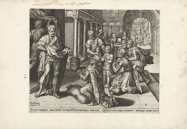
Dimensions: height 195 mm, width 243 mm
Copyright: Rijks Museum: Open Domain
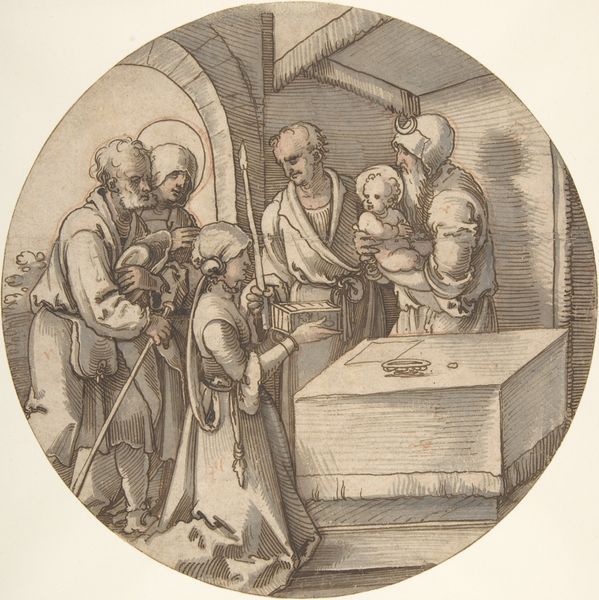
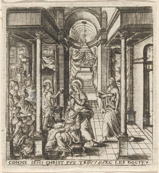
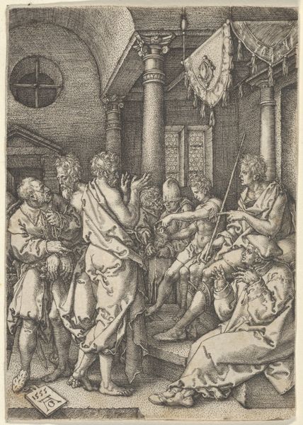
Editor: This is "Afscheid van Tobit en Anna," created sometime between 1556 and 1633, currently held at the Rijksmuseum. The medium looks like an etching or engraving. My initial impression is of a rather formally arranged domestic scene, a very clean and contained narrative, despite the subject. What do you see in this piece? Curator: Immediately, I'm drawn to the composition itself. Observe the clear division of space, creating two distinct yet connected narratives: Tobit’s farewell juxtaposed with the background scene. How does this fracturing affect your perception of the main subject matter? Editor: Well, the symmetry makes it feel very staged, artificial almost. But why use this rigid structure? Curator: Note how the artist utilizes linear perspective to create depth, directing our gaze into the composition. Also, contemplate the effect of light and shadow. Notice how highlights delineate form, but what emotional response do the stark contrasts generate within you? Editor: The strong contrast definitely adds drama, even though the lines themselves seem so controlled and precise. Is that a common element in Baroque engravings? Curator: Indeed. Think of line quality as a language. The sharp, decisive lines create a sense of order. This precision could reflect a cultural value, an embrace of clarity amid the complex religious and political environment of the period. How does the detail of the line work contribute to a cohesive artistic language? Editor: I hadn't considered the line itself having meaning, but seeing it this way shows that everything, even the smallest detail, plays into the whole feeling. Curator: Precisely. Formal analysis opens up layers beyond the obvious.
Comments
No comments
Be the first to comment and join the conversation on the ultimate creative platform.
More like this