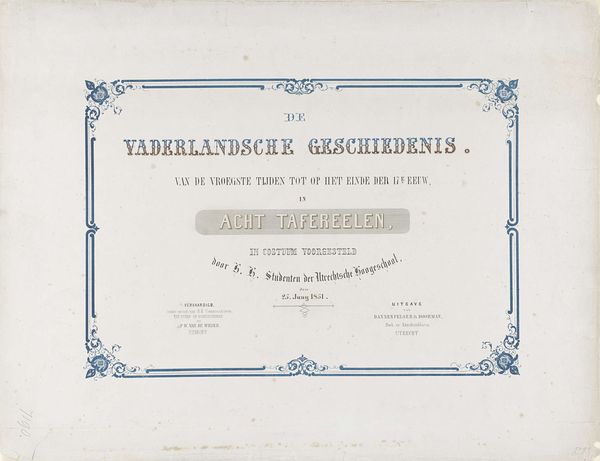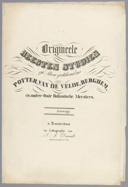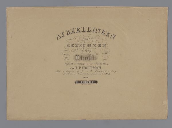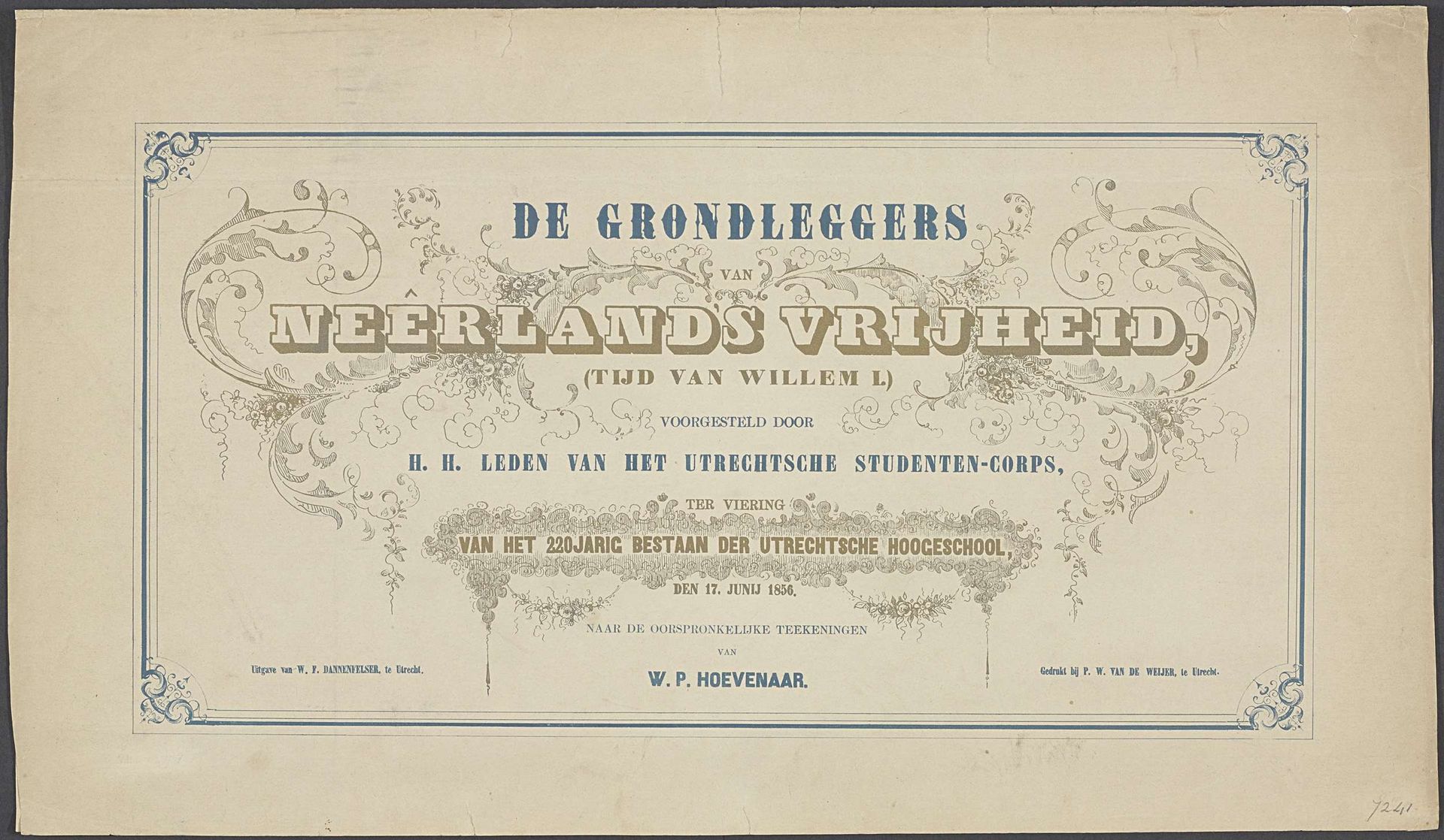
1856
Omslag voor serie prenten van de Utrechtse maskerade, 1856
Pieter Wilhelmus van de Weijer
1816 - 1880Location
RijksmuseumListen to curator's interpretation
Curatorial notes
Editor: Here we have the cover for a series of prints related to a masquerade in Utrecht, dating back to 1856 and crafted by Pieter Wilhelmus van de Weijer. It’s aged, but the typography has an ornate beauty to it, although somewhat rigid, almost academic, I’d say. What strikes you most about its composition? Curator: The formal arrangement is, indeed, paramount. Observe how the title is centered and given prominence through a heavier, shadowed typeface, contrasted against the delicate, almost Rococo-esque flourishes that frame the lettering. Consider how the symmetry creates a balanced and ordered design, reflective of Neoclassical principles that valued clarity and rationality. How does the interplay of text and ornament function? Editor: It feels like the text is the skeleton, dictating the structure, and the ornamentation acts as embellishment, softening the hard edges, but still confined within that rigid structure. It’s like trying to add flair but within very strict boundaries. Is that the right idea? Curator: Precisely. The typography’s clear hierarchy draws the eye through the layers of information, moving from the general subject to the specifics of the event. Note the different weights and styles used to delineate these layers. Also consider the texture created by the aged paper; this contributes to the overall aesthetic. What meaning might be drawn from the aged appearance? Editor: Perhaps to emphasize the historical significance or evoke a sense of reverence? The piece speaks to the founding fathers of Dutch freedom, so this texture almost solidifies the concept? Curator: Indeed. Through its composition and technique, the artist invites reflection on history and the importance of the depicted celebration, employing formal elements to create a cohesive and meaningful design. Editor: I see now how every choice in typography, ornament and aged paper surface contributes to a larger message, focusing purely on the formal execution. Thanks for guiding me through this.