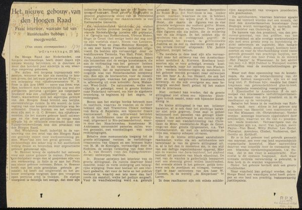
Possibly 1924
Krantenknipsel uit archief Philip Zilcken
Listen to curator's interpretation
Curatorial notes
Curator: Here we have “Krantenknipsel uit archief Philip Zilcken,” possibly dating back to 1924. It's a newspaper clipping from the Philip Zilcken archive. Editor: Immediately, the aged paper jumps out. The fading ink and delicate fibers tell a story of time and handling. There's a visual softness and fragility that contrasts sharply with the presumed original purpose of the text. Curator: Exactly. Considering its purpose as a component from an archive, its context shifts our perception. What can you tell from the typography? Editor: There’s hand-lettering visible at the top, a faded script that gives it a personal, almost intimate quality despite being part of a larger printed text. It suggests a specific hand, a particular style of the artisan of the text that predates mechanical mass production. Curator: Good. I’d like to introduce here the significance of its being a newsprint clipping. In what way does this particular item fit into the broader means of journalistic and publishing production during that time? Editor: The choice of paper points to the ephemerality of news. It wasn't intended to last. This archived scrap acquires value through its survival, documenting a moment's social or political concerns made material. The labor is implicit; someone physically laid out these texts, organized them, pasted them… Curator: I'd also add the act of archiving— someone valued this enough to preserve it. It transforms a piece of everyday life into a document worth keeping. Does the type face reveal any clues? Editor: Not just the individual letters, but how they are placed to convey layout—the form has symbolic relevance as well. The typeface looks like it could be influenced by early 20th-century grotesque styles, but there's still some individuality. I love that irregularity of older print methods. Curator: I agree, which speaks to the changing technological and industrial advancements made during the early part of that century. It would be helpful for the viewers to keep that contrast between progress and what it left behind, or depended upon, as they tour the show. Editor: Absolutely, the material itself – the fading print, the yellowed paper - communicates loss. It speaks volumes, beyond just the literal text, and really resonates even now.