print, engraving
baroque
landscape
cityscape
engraving
Dimensions: height 509 mm, width 596 mm
Copyright: Rijks Museum: Open Domain
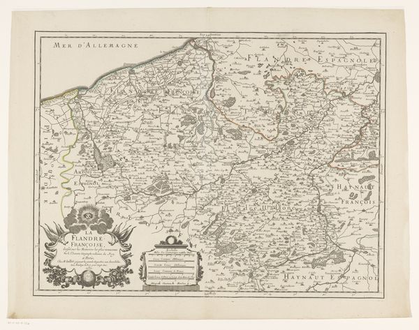
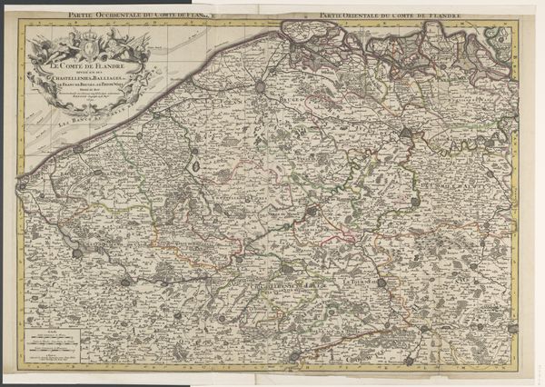
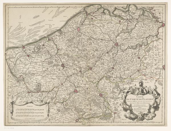
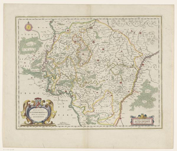
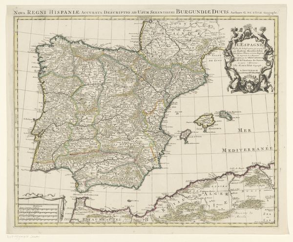
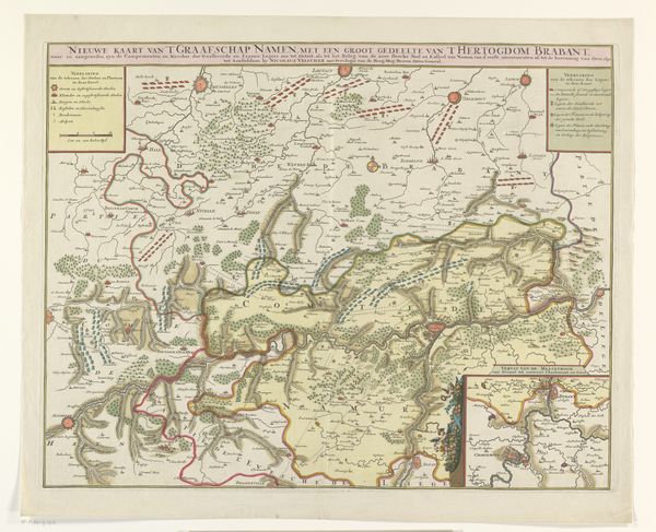
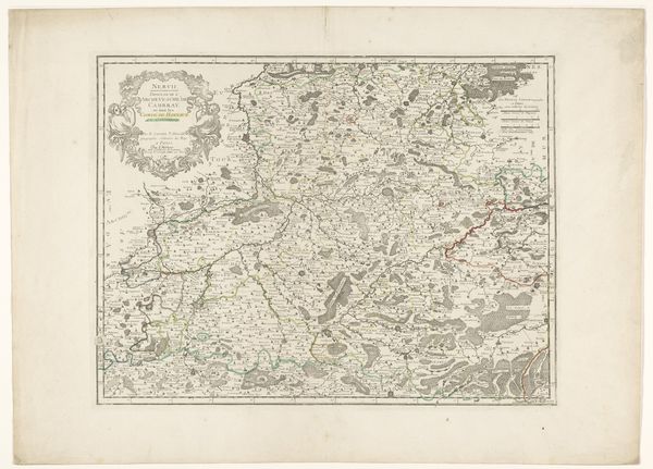
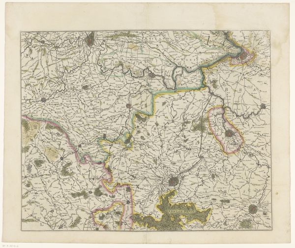
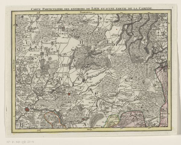
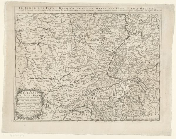
Curator: Welcome! Before us, we have "Kaart van Zuid-Portugal en Zuidwest-Spanje," created in the late 1690s or early 1700s. Abraham Allard, a prominent figure in Amsterdam’s cartography scene, is the artist responsible for this work. It's an engraving, part of the Rijksmuseum's collection. Editor: The precision! The rendering of every contour with such even line weights gives it a tranquil and airy quality, almost meditative. It’s less a document, more a spatial poem. Curator: That tranquility masks a complex political landscape. Allard was working in a period of intense mercantile and colonial competition. Maps like these were not just navigational tools but instruments of power, defining territories, resources and spheres of influence. Editor: I can see that underlying tension, now that you mention it. The composition seems meticulously balanced, almost artificially so, like each section is vying for equal visual weight. It almost reminds me of those landscapes within landscapes by Bruegel. Curator: Exactly! Allard's choices, from the inclusion of certain towns to the highlighting of waterways, all spoke to the geopolitical interests of the Dutch Republic at the time. Spain and Portugal held immense strategic significance given their global empires, so mapping this area became vital. The prominence of coastlines indicates as much! Editor: The execution style then underscores this era; the clear engraving contrasts to softer watercolor renderings. Everything looks neatly defined. What else about the form adds historical weight? Curator: Consider the use of Latin in the title, for instance. This elevates the map's status. By using the academic language of the time, it projects an image of scientific rigor and authority. That itself becomes a statement about the map maker, the city it’s produced in, and perhaps even about those using it for trading voyages. Editor: So every line, every font, and even the choice of language played a role in conveying authority. Curator: Precisely. A map, you see, never just shows what is there. It always shows what the mapmaker – and their patrons – wanted others to see. Editor: Knowing the background gives the artistry a richer texture. I was caught by its peaceful visual at first. Curator: It's a delicate dance between surface aesthetics and deeper historical meanings, isn’t it? Cartography is far more complex when we analyze its underlying layers. Editor: True! It becomes like cracking a secret code, making the viewing much richer.
Comments
No comments
Be the first to comment and join the conversation on the ultimate creative platform.