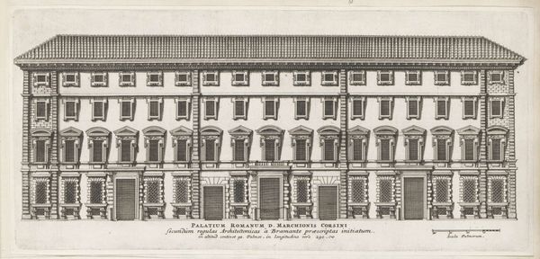
print, etching, architecture
#
baroque
#
dutch-golden-age
# print
#
etching
#
historical photography
#
old-timey
#
cityscape
#
architecture
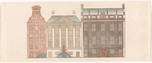
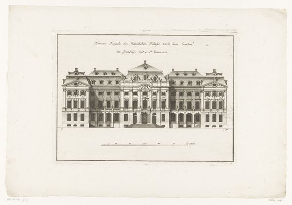
Dimensions: height 124 mm, width 217 mm
Copyright: Rijks Museum: Open Domain
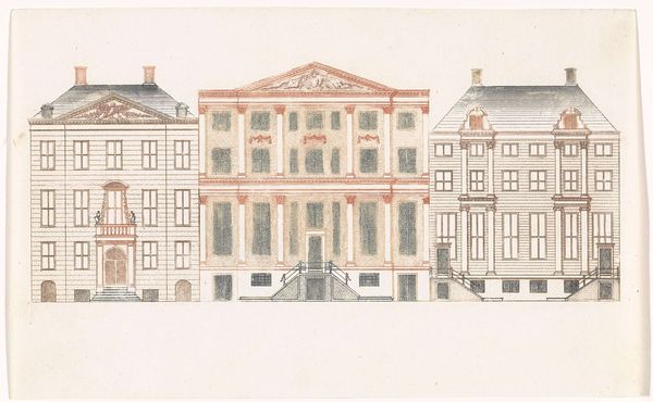
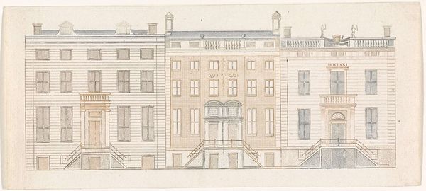
Curator: Before us, we have an etching from the Dutch Golden Age, created between 1696 and 1706. The print depicts "Amsterdamse grachtenhuizen aan de Herengracht 480-488" or, Amsterdam canal houses at Herengracht 480-488. The artist, alas, remains anonymous. Editor: It’s incredibly precise. Almost architectural in its rigidity. The subdued palette creates a calm, ordered atmosphere. Yet, there's something also slightly...clinical about it, lacking warmth. Curator: The lack of people, certainly. To your point, considering the Dutch Golden Age context, we could reflect on the role of urban planning and wealthy merchant families shaping Amsterdam, literally building their power in these canal-side residences. These houses were physical manifestations of status, power, and connection to global trade networks. Editor: Indeed. Notice the rhythmic placement of the windows and the clear demarcation of the houses. It’s almost like a musical score. Look at the leftmost house – its façade explodes in ornamentation and varied brick textures. The artist contrasts the use of brick versus clean painted pillars between neighboring residences creating an alternating aesthetic. This highlights a baroque visual vocabulary even in the composition of domestic architectures. Curator: I agree, and within that ornamentation lies social meaning. Those details would have been deeply intertwined with ideas about prosperity and societal status, signaling not only personal achievement but also projecting a certain image for those moving through Amsterdam’s elite circles. The absence of people, then, strangely reinforces their invisible power structuring urban life. Editor: I am intrigued by the varying colors used, each building with unique hues on each section that emphasize its shape. The blue foundation brings out the red front, establishing depth in two dimensions. What I appreciate most here is its ability to evoke a sense of measured prosperity. It's a snapshot of a moment of economic and social transformation viewed through design principles. Curator: And now, looking at it with fresh eyes, I think I can appreciate how this print, even devoid of human figures, whispers volumes about social hierarchies, material culture, and the invisible structures that shape our environments. Editor: Yes. The analysis of form, composition and the architectural qualities reveal much to understand about this image.
Comments
No comments
Be the first to comment and join the conversation on the ultimate creative platform.
More like this