engraving
#
portrait
#
baroque
#
dutch-golden-age
#
figuration
#
line
#
14_17th-century
#
engraving
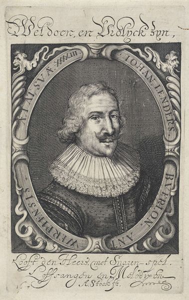
Dimensions: height 327 mm, width 204 mm
Copyright: Rijks Museum: Open Domain
Editor: We're looking at "Portret van Jacobus Edelheer," an engraving from 1633 by Crispijn van de Passe the Younger, residing here at the Rijksmuseum. What strikes me most is the intricate detail rendered purely in lines. How do you interpret this work, and how does its medium affect our perception of the subject? Curator: Isn’t it incredible? I'm immediately transported to a time of poised elegance, you know? There’s a seriousness, of course, but look closer - the almost playful curls in his hair, that subtle, knowing glint in his eyes... It's an era of holding yourself *just so*, of mastering the art of a perfectly contained presence. I suppose, could you even say it's slightly theatrical? Do you get that vibe? The curtain pulled back ever so slightly behind him... Editor: I see what you mean! Almost like he's presenting himself on a stage. Curator: Exactly! Engraving, in its own way, demands that performative perfection, don't you think? There’s such a deliberateness about each line. It’s like meticulously carving out someone’s very essence! Look at that crisp white collar and the gentleman's velvety doublet--they become so incredibly tactile, rendered as tones of gray, like sculptures of shade. It begs the question, does it give us *more* or *less* insight into who Jacobus Edelheer truly was? I wonder. Editor: That’s fascinating. I never considered how the artistic process could influence our perception of the sitter so directly. Curator: Indeed! I believe art often holds up a mirror not only to its subject but to the artist—and us too, looking back across the centuries. Editor: Well, I will be contemplating the layers embedded in this piece! Curator: Me too. It's in the conversation, truly, that art opens itself up, no?
Comments
No comments
Be the first to comment and join the conversation on the ultimate creative platform.
More like this