print, engraving
#
dutch-golden-age
# print
#
landscape
#
geometric
#
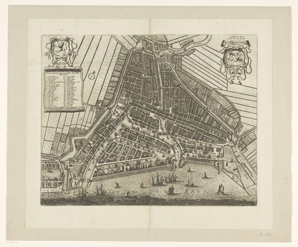
cityscape
#
history-painting
#
engraving
Dimensions: height 512 mm, width 591 mm
Copyright: Rijks Museum: Open Domain
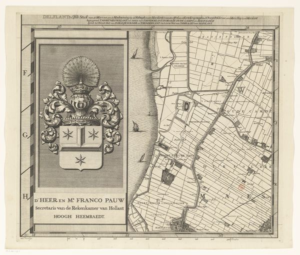
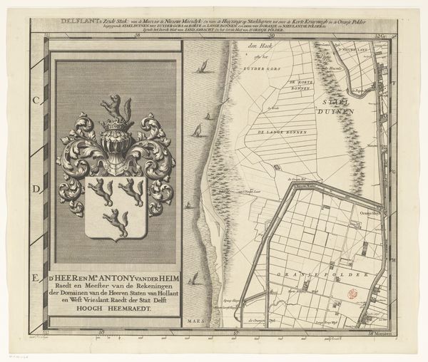
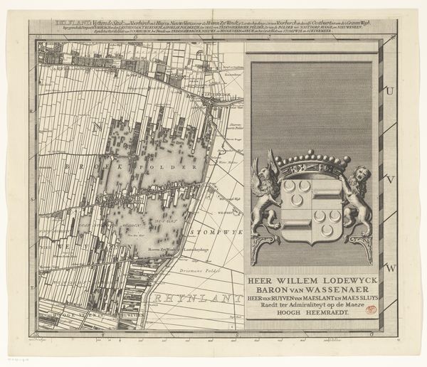
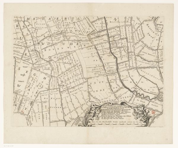
Curator: Let's consider this fascinating piece titled "Kaart van het Hoogheemraadschap van Delfland (zestiende deel)"—part of a series mapping the Delfland water board—dating roughly from 1712 to 1735, created by Luggert van Anse. It's an engraving. Editor: Immediately striking is the stark geometry—the rigidity of the lines contrasting with what I imagine is a very organic landscape. The grays are a bit monotonous, but that linearity is really what defines it, creating almost an abstract feel. Curator: Indeed, but it's a very specific and practical abstraction! The image reveals how the Dutch meticulously engineered their environment through the management of waterways. Look how it highlights polders, reclaimed lands crucial to the economic power of the Dutch Golden Age. Editor: Ah, so the almost severe lines are reflective of control, the imposition of order onto nature itself. You see it reinforced with the coat-of-arms to the left—figures wielding swords! There is that top-down dominance. The composition divides into that heraldic display and then that grid pattern on the right. Curator: Absolutely. The arms relate directly to the water board’s authority. Jacob Meerman, whose name appears beneath the cartouche, was the secretary of the water board for Delfland. So the piece serves not just as a map, but as a representation of institutional power. Editor: The lack of any human presence—that's interesting too. Is the power somehow enhanced by erasing humanity? It would become about land alone. Curator: It speaks volumes, I think, about the Dutch Republic’s focus during that period on technological innovation and, of course, commerce. The engraving normalizes the power structures in society during this era. Editor: Thinking about it more, the texture in the heraldry is striking when set against the rest of the print. Is it an emphasis that could even be perceived as a distraction? Perhaps to pull the eye leftward? Curator: Could be a sign of where they placed emphasis, or that part needed more flourish for its symbolic effect. So while a map may not feel like your standard political image, I’d argue the visual choices made by Luggert Van Anse tell us as much as its practical details. Editor: Well, I appreciate you guiding me on seeing this landscape as more than merely austere—now I can better feel how control and order permeate both its function and its appearance.
Comments
No comments
Be the first to comment and join the conversation on the ultimate creative platform.
More like this