Copyright: CC0 1.0
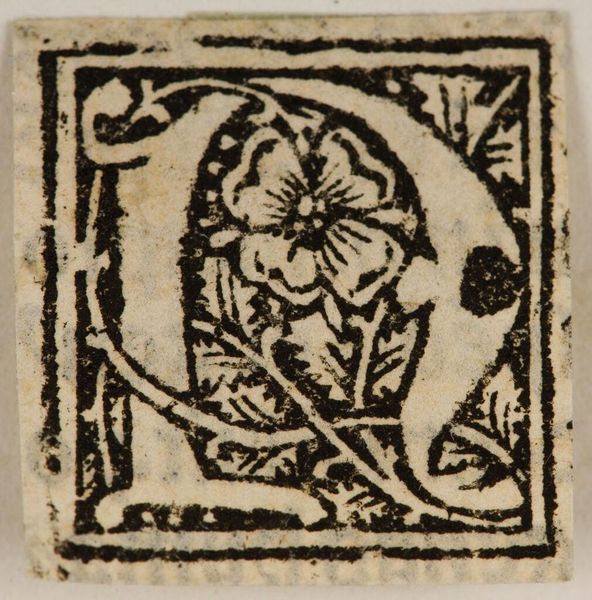
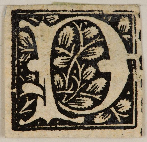
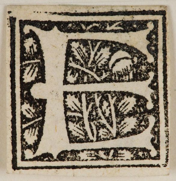
Curator: This is "Initial P," created by an anonymous artist. What strikes you first? Editor: The bold contrast! Black ink forming an ornate letter "P," set against what looks like handmade paper. It feels medieval, a fragment of some larger, illuminated work. Curator: Exactly. Consider the labor invested in creating such detail. The block printing process meant carving away negative space, revealing the design in relief. Each print requires careful hand-application. Editor: The floral motifs inside the "P" give it a sense of organic growth, contrasting nicely with the geometric rigidity of the letterform itself. The unknown artist clearly understood compositional balance. Curator: And what was the social purpose of this production? Was it for religious text, secular documents, or something else? Thinking about where it sits in the hierarchy of art is important. Editor: Yes, contextualizing this piece, it's beautiful how the form and function unite in such a seemingly simple yet powerful design. Curator: Indeed, there's a tactile quality that's lost in our digital age.
Comments
No comments
Be the first to comment and join the conversation on the ultimate creative platform.
More like this