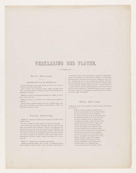
graphic-art, print, etching, paper, typography
graphic-art
etching
paper
typography
Dimensions: 309 mm (height) x 229 mm (width) (bladmaal)
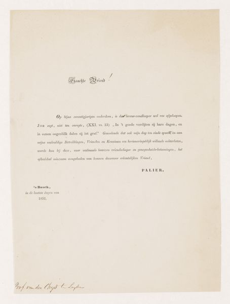
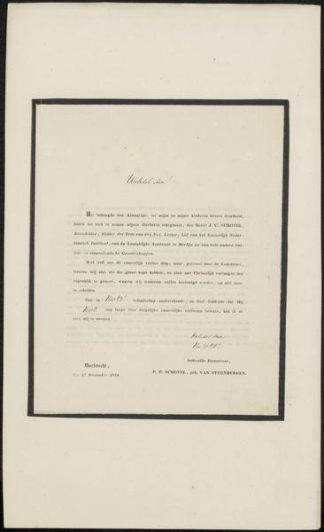
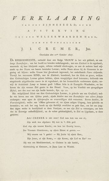
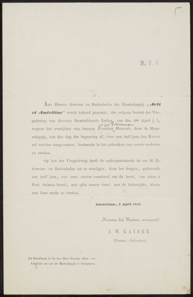
Editor: This is "Titelblad til vernis mou raderinger" from 1897 by Carl Locher. It’s a print, etching on paper… essentially an advertisement. I’m immediately struck by how much text there is! What do you see in this piece? Curator: It’s fascinating how Locher intertwines the visual with the textual. In the context of late 19th-century Denmark, this piece isn't simply an advertisement. It reflects the era’s burgeoning art market, where artists needed to self-promote. The text details the technique of "vernis mou," a soft ground etching, appealing to a discerning, art-educated audience. We also need to consider how capitalism and industrialization were influencing art at the time, blurring the lines between creation and commercialization. The language seems catered to cultural elites of the time. I wonder, what might this suggest about the social hierarchies influencing the art world during Locher’s time? Editor: That’s interesting! So it's almost like Locher is legitimizing his work by highlighting the craft and artistry behind it, within a market-driven context. I guess the question I still have is - is he playing into or pushing against the commercialization of art with this piece? Curator: That tension is key! He’s likely navigating both. Artists of his era had to find patrons and appeal to the market to survive. However, he is attempting to frame graphic art, which is easily reproducible and disseminated, as being high-level artistic achievement. There's a power dynamic in asserting value and aesthetic judgment; in many cases, the commercial can’t occur unless this judgment is formed. So, there’s no surprise he tries to steer art-buying culture in a direction favorable to his creation. Editor: That makes a lot of sense. I had been thinking about it simply as promotional material, but understanding the historical and social implications adds so much more to the image. Curator: Exactly! And thinking about who had access to this type of art at the time invites a conversation about class, patronage, and access. Hopefully, by digging into some intersectional areas, the historical function of an advertisement comes more clearly into focus!
Comments
No comments
Be the first to comment and join the conversation on the ultimate creative platform.
More like this