drawing, paper, pencil, graphite
#
portrait
#
drawing
#
dutch-golden-age
#
figuration
#
paper
#
pencil
#
graphite
#
genre-painting
#
realism
Copyright: Rijks Museum: Open Domain
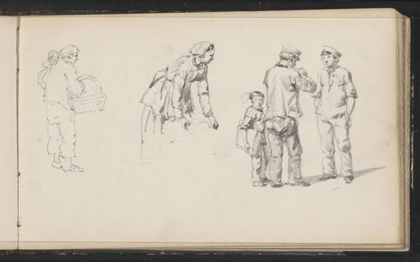
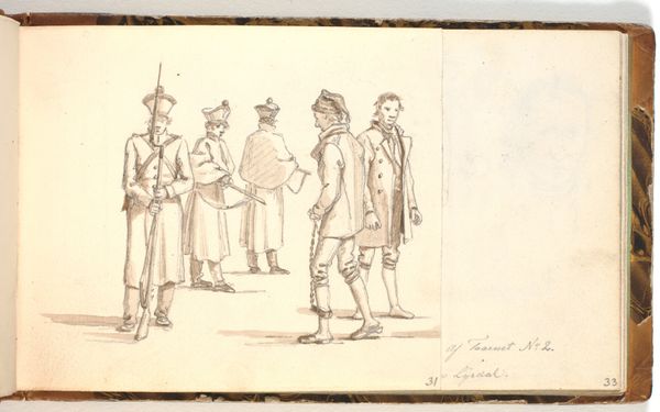
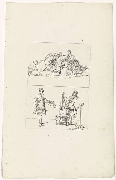
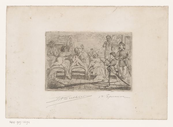
Editor: This drawing, "Figuren in zeventiende-eeuwse kleding," by Cornelis Springer, dates to around 1882. It's rendered in graphite on paper. It has this quiet, almost ghostly quality due to the soft pencil strokes. What stands out to you in terms of its composition and technique? Curator: The reduction to line is quite compelling here, wouldn't you agree? Consider the ways Springer has used subtle gradations of tone through hatching and cross-hatching to delineate form and create spatial depth. Notice how he directs our eye through the strategic placement of these figures. Editor: Yes, the figure in the foreground certainly anchors the piece. But, it feels less about individual expression, and more about the rendering of historical garments and forms. Would you agree? Curator: Precisely. The intrinsic interest lies not in emotive display or psychological probing, but in the almost scientific rendering of form and texture through graphite. Consider the way light plays across the folds of fabric, achieved with such minimal means. It reveals much about his mastery of technique, doesn't it? Editor: I see what you mean. It's like a study in textures and shapes, divorced from deeper meaning. Thanks for pointing that out. Curator: The very limitations of the medium, I'd say, give rise to its expressive potential in this case. Thank you. I noticed more on this pass, as well.
Comments
No comments
Be the first to comment and join the conversation on the ultimate creative platform.
More like this