drawing, print, paper, ink, engraving, architecture
#
drawing
#
ink paper printed
# print
#
paper
#
form
#
11_renaissance
#
ink
#
coloured pencil
#
geometric
#
column
#
line
#
academic-art
#
paper medium
#
engraving
#
architecture
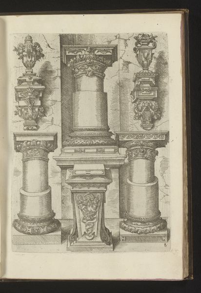
Dimensions: height 237 mm, width 296 mm
Copyright: Rijks Museum: Open Domain
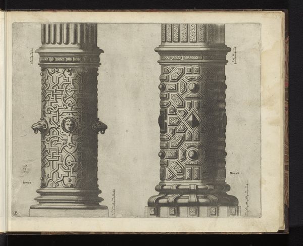
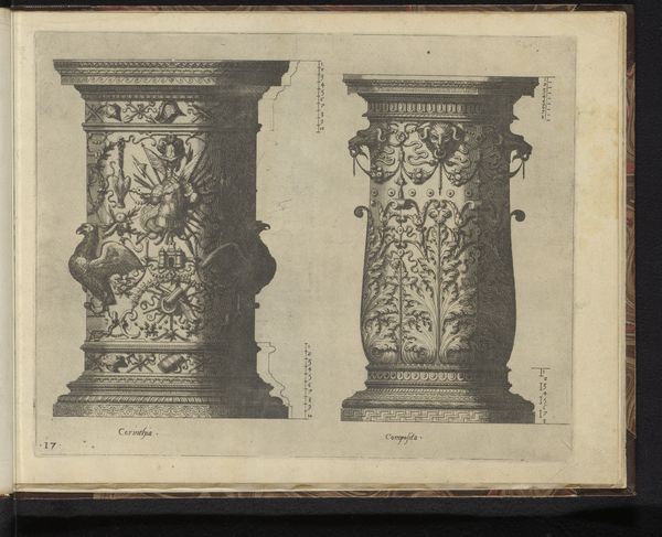
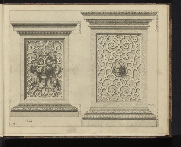
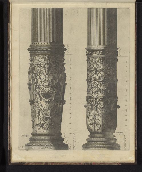
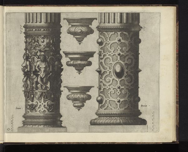
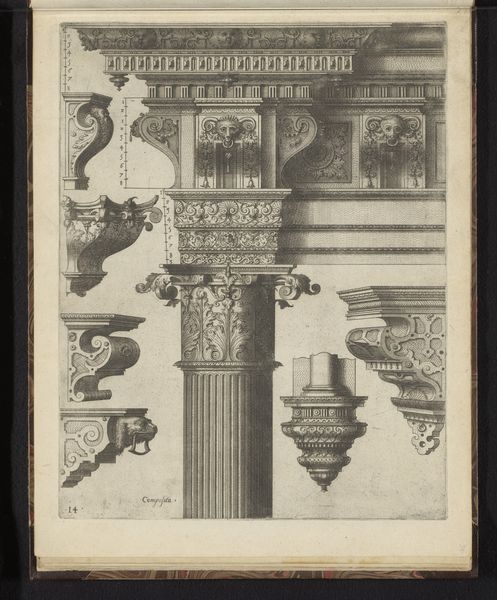
Curator: Today we're looking at "Twee 'columnae caelatae' en twee consoles," which translates to "Two 'decorated columns' and two consoles," a print made by Johannes or Lucas van Doetechum in 1578. Editor: My eye is drawn to the striking contrast in the two columns; one feels almost playfully ornamented, with bold geometric shapes, while the other displays a more classically refined fluted design. Curator: Precisely. This print offers a fascinating glimpse into the architectural aesthetics circulating in the late 16th century. Prints like this were not necessarily meant as representations of existing structures, but more as pattern books for architects and artisans. Editor: So, this engraving served almost as a catalog of design elements. I find the graphic quality intriguing—the use of line and shadow to describe form. It's meticulously rendered; look at the detail in the acanthus leaves. Curator: Indeed, it was a time when the circulation of visual ideas played a crucial role in shaping architectural trends across Europe. These printed images allowed for the rapid dissemination of design motifs and construction techniques. And not just for architects: consider the furniture makers or sculptors who would adapt such patterns. Editor: That's right; its accessibility across media contributed to a more broadly informed design language. And, you can appreciate how printmaking could elevate these artisans' visibility through circulating their design vocabulary in books. It's interesting how the stark presentation – the black ink on paper – directs your focus right at the line itself and forces appreciation of pure shape. Curator: That is one of the things I love about this print. It invites us to consider how styles evolve, are adopted, and repurposed in different cultural contexts. Editor: It's remarkable to witness through these stark designs, a very clever balance between artistry and architectural knowledge, how styles take root and spread. These simple columns aren't as simple as they appear at first glance!
Comments
No comments
Be the first to comment and join the conversation on the ultimate creative platform.
More like this