drawing, print, metal, paper, engraving, architecture
#
drawing
#
aged paper
#
toned paper
# print
#
metal
#
old engraving style
#
sketch book
#
paper
#
11_renaissance
#
personal sketchbook
#
geometric
#
pen and pencil
#
paper medium
#
engraving
#
pencil art
#
architecture
#
historical font
#
columned text
Dimensions: height 236 mm, width 300 mm
Copyright: Rijks Museum: Open Domain
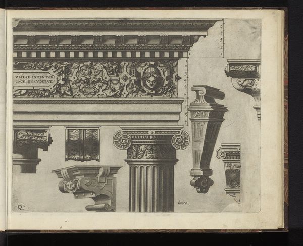
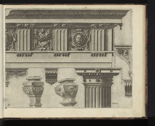
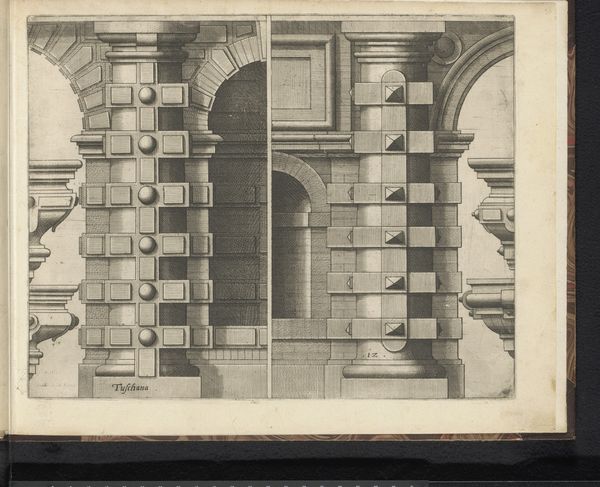
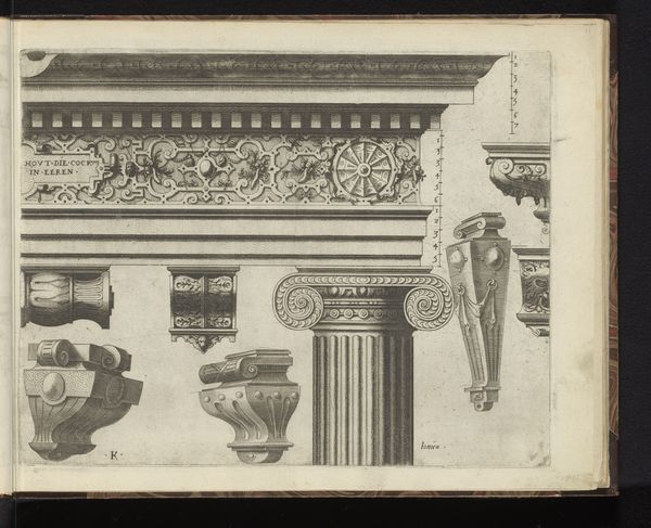
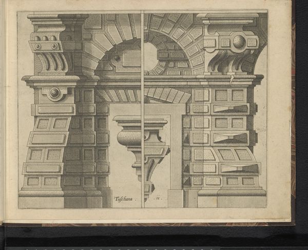
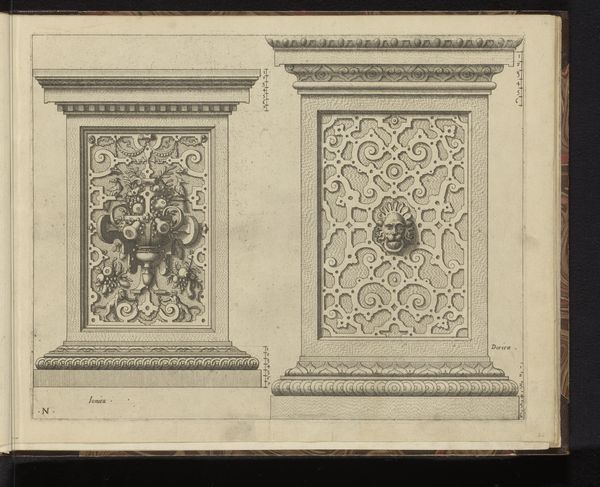
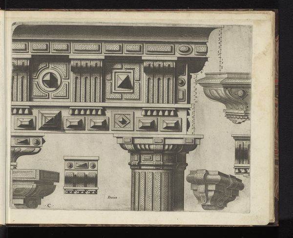
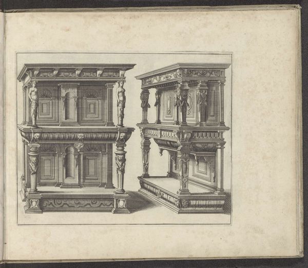
Curator: Welcome. Here we have "Dorisch hoofdgestel en zeven consoles," an engraving by Johannes or Lucas van Doetechum, dating back to 1565. It resides here at the Rijksmuseum. Editor: Immediately, I'm struck by the austerity. It feels like an architect's notebook, meticulously planned and starkly presented. A world away from the curves that baroque followed it with. Curator: That’s perceptive. This wasn’t intended as a standalone artwork in the modern sense. Engravings like these circulated as design prototypes, part of a larger visual culture that informed architectural practices. They played a key public role at that time. Editor: So, less "art for art's sake" and more about disseminating aesthetic and structural ideas. Makes you think about accessibility – who got to see these designs and whose built environments benefited from them? The clean lines are elegant, sure, but did they democratize design or further entrench power structures? Curator: A pertinent question. Printmaking allowed wider circulation than, say, a single master architect’s sketches, but access still depended on social position. These models reinforced classical ideals, aligning patrons with a lineage of power, historically linked to elite, usually male, governance. Editor: Right, these classical forms are inherently linked to ideals, both aesthetic and socio-political. The 'perfection' of the Doric order naturalizing hierarchical forms. The cool detachment of the presentation also speaks volumes. Where’s the human element? Curator: You see that detached presentation as a drawback, and I can agree that the removal of the hand from a designed print gives this piece a mechanical aesthetic quality, even if the drawing was done by hand before it was translated to print. The printing trades have traditionally operated as a sort of factory that allows humanism to propagate through reproducibility, and at the core, its message must be one of structure and ideals to carry that weight and impact. Editor: Hmm, perhaps the value lies in uncovering these complex, layered implications. It prompts us to question whose stories and aesthetics are perpetuated and at whose expense. Even an architectural print opens to larger cultural discussions. Curator: Indeed. By investigating its function within 16th-century society, it prompts us to recognize the ongoing relevance of those power dynamics in today’s design and built environment. Editor: Well, it certainly moved me to consider architecture with renewed suspicion. Now, let's go and look at something messier. Curator: Agreed. Messiness is sometimes more truthful. Let's move on.
Comments
No comments
Be the first to comment and join the conversation on the ultimate creative platform.
More like this