painting, acrylic-paint
#
painting
#
acrylic-paint
#
abstract
#
geometric
#
capitalist-realism
#
geometric-abstraction
#
modernism
#
monochrome
Copyright: Modern Artists: Artvee
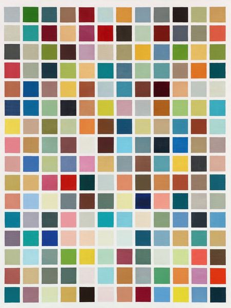
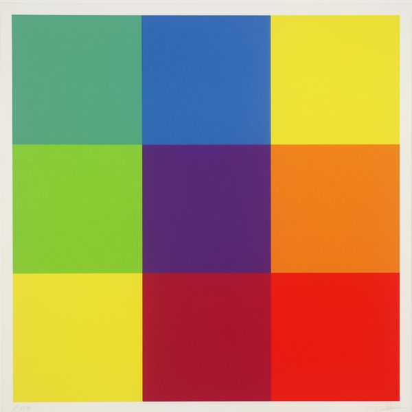
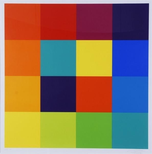
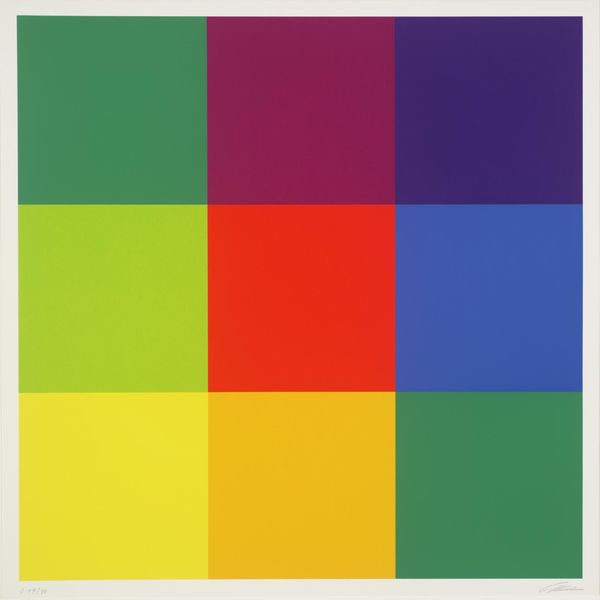
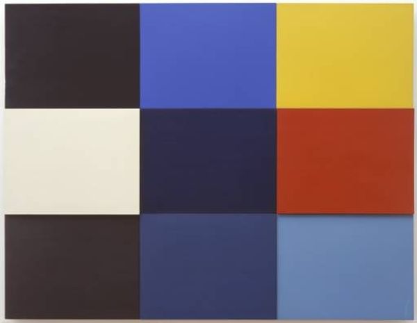
Gerhard Richter made "Fünfzehn Farben" or "Fifteen Colors" without a known date, probably with paint. The squares are laid out in a grid like a paint chart, but the selection of colors, the matte surface, and the way they are arranged make the whole thing feel weirdly impersonal. It reminds me of Sol Lewitt but with a painterly touch. Look closely and you can see the faint traces of brushstrokes and subtle variations in tone. Richter doesn't want us to be transported by the image, or to feel the artist's hand at play. Instead, he emphasizes the material properties of paint itself. I love the way that the squares of color invite us to compare and contrast. I keep coming back to that pale grey in the top left. It feels so quiet and restrained next to the bright yellow below it, or the more vibrant shades around it. It’s about the ongoing conversation of art history.
Comments
No comments
Be the first to comment and join the conversation on the ultimate creative platform.
More like this