About this artwork
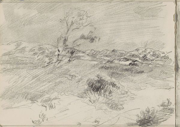
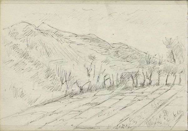
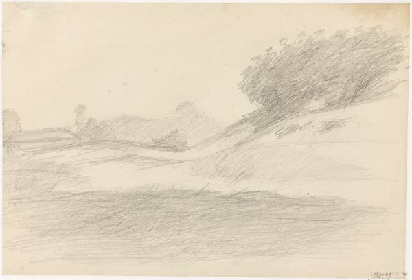
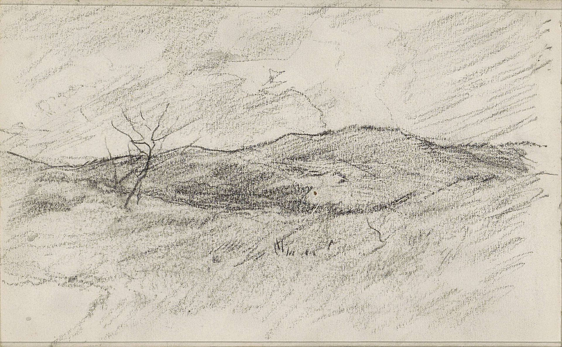
Editor: Here we have Anton Mauve’s "Heuvellandschap," created sometime between 1848 and 1888, rendered in pencil. It strikes me as quite stark and desolate. What do you see in this piece? Curator: The power of this landscape resides, primarily, in the artist's manipulation of line and tone. Notice the density of the pencil strokes, particularly in the hillside, which creates a palpable sense of weight and mass. Conversely, the sky is rendered with lighter, more diffuse strokes. How do these contrasting techniques affect your reading of the image? Editor: It does give a lot of depth to the landscape itself. But there is only the vaguest, faintest differentiation between the field in the foreground and the heavy hills behind it. Curator: Precisely. The ambiguity of the forms, achieved through subtle variations in tone, invites closer inspection. Consider the single, skeletal tree. Its stark linearity punctuates the scene, offering a counterpoint to the more amorphous shapes of the land. How does its presence alter the overall composition? Editor: It's almost like the tree gives the hill dimension, creating space where otherwise everything felt flat. The composition gives the stark, desolate feeling that I mentioned at the beginning. Curator: An astute observation. Ultimately, the artist creates a visual dialogue between the solid and the ephemeral, the tangible and the intangible, inviting us to contemplate the essential elements of the natural world through its form. Editor: I hadn't really focused on the use of tone to create these contrasts, but that helps to appreciate the formal elements a bit more.
Artwork details
- Medium
- drawing, pencil
- Location
- Rijksmuseum
- Copyright
- Rijks Museum: Open Domain
Tags
drawing
pencil sketch
landscape
pencil
realism
Comments
No comments
About this artwork
Editor: Here we have Anton Mauve’s "Heuvellandschap," created sometime between 1848 and 1888, rendered in pencil. It strikes me as quite stark and desolate. What do you see in this piece? Curator: The power of this landscape resides, primarily, in the artist's manipulation of line and tone. Notice the density of the pencil strokes, particularly in the hillside, which creates a palpable sense of weight and mass. Conversely, the sky is rendered with lighter, more diffuse strokes. How do these contrasting techniques affect your reading of the image? Editor: It does give a lot of depth to the landscape itself. But there is only the vaguest, faintest differentiation between the field in the foreground and the heavy hills behind it. Curator: Precisely. The ambiguity of the forms, achieved through subtle variations in tone, invites closer inspection. Consider the single, skeletal tree. Its stark linearity punctuates the scene, offering a counterpoint to the more amorphous shapes of the land. How does its presence alter the overall composition? Editor: It's almost like the tree gives the hill dimension, creating space where otherwise everything felt flat. The composition gives the stark, desolate feeling that I mentioned at the beginning. Curator: An astute observation. Ultimately, the artist creates a visual dialogue between the solid and the ephemeral, the tangible and the intangible, inviting us to contemplate the essential elements of the natural world through its form. Editor: I hadn't really focused on the use of tone to create these contrasts, but that helps to appreciate the formal elements a bit more.
Comments
No comments