# print
#
linocut print
#
geometric
#
abstraction
#
modernism
Copyright: National Gallery of Art: CC0 1.0
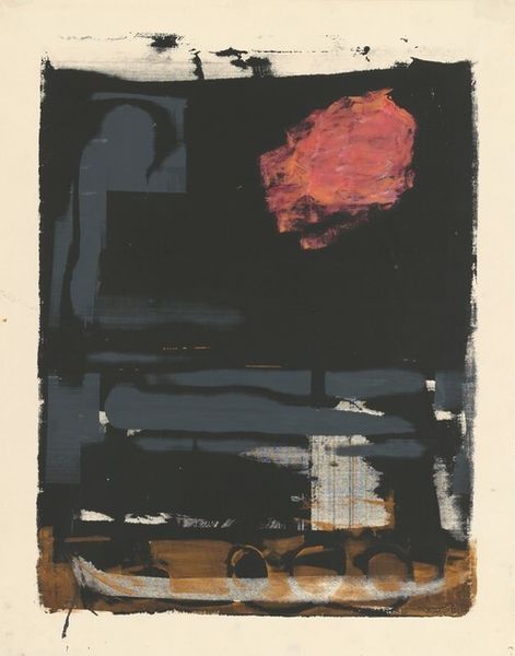
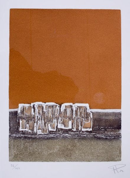
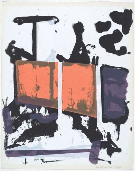
Editor: This is Louis Bunce’s "Untitled" from 1961. It's a print, a linocut print to be exact. The contrast between the structured orange bar at the top and the chaotic purple forms below is striking. How do you interpret this work? Curator: Its strength lies in the interplay of form and line. Observe how the rigid geometry of the orange rectangle engages with the textured density of the violet cluster. What semiotic relationship is implied by their juxtaposition? Editor: The rectangle feels very assertive and modern, while the lower part seems more organic. Maybe the sharp line divides different mental spaces? Curator: Precisely! Consider the modernist emphasis on the inherent qualities of the materials. The very texture of the linocut contributes meaning. The orange calls attention to the negative space, and the overall abstraction invites subjective readings without symbolic constraints. Editor: I didn’t think about it that way, so it is the interaction of the two colors creating the main affect in this art? Curator: Color is critical. Consider the boldness of the orange and violet tones and their strategic placement within the composition. Ask yourself how the artist uses visual tension, through form and color to create an overall impact. Do these shapes exist anywhere else in art from this period? Editor: I guess they echo many pieces made with found objects from the time? Thank you! This has truly opened my eyes. Curator: Indeed. Paying careful attention to form, material, color, and arrangement brings insight, as the structure allows. It has been a delight to help clarify.
Comments
No comments
Be the first to comment and join the conversation on the ultimate creative platform.
