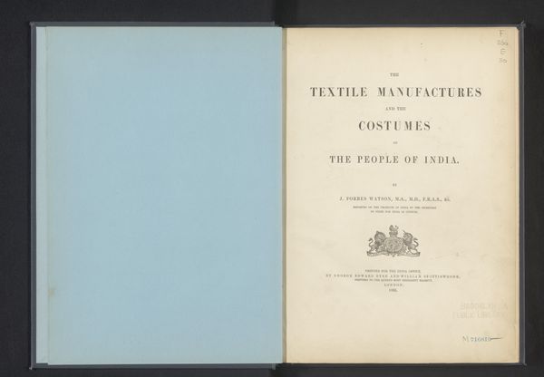
Collection of specimens and illustrations of the textile manufactures of India. Second series : Kincobs, Nos. 401 to 458 1873 - 1880
0:00
0:00
print, typography
# print
#
london-group
#
typography
#
england
#
orientalism
#
decorative-art
#
historical font
Dimensions: (h x w x d) 13 13/16" x 10 7/16" x 1 15/16" (33.5 x 26.5 x 5cm)
Copyright: Public Domain
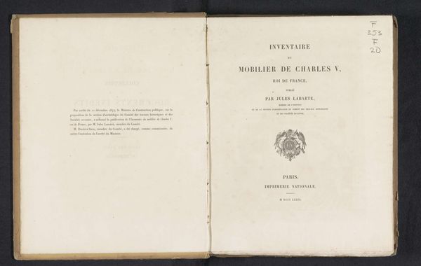
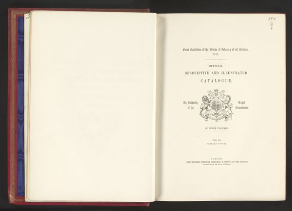
Editor: This is the title page from "Collection of Specimens of the Textile Manufactures of India," created between 1873 and 1880 by John Forbes Watson. It's a print and seems very straightforward in its layout and design, and feels a bit detached. What strikes you when you look at this? Curator: Formally, I’m drawn to the arrangement of the typography. Consider the hierarchy at play: “Collection of Specimens” is balanced by “India Museum, 1873”, drawing the eye towards the more ornate typography of "Kincobs". Notice the symmetry and the implied vertical axis that governs the composition, with the heraldic emblem serving as the focal anchor. How does that emblem play into this organizational schema? Editor: The emblem almost serves as a keystone in an archway. So, you're suggesting that it holds together the composition formally, as well as being an important part of what's being communicated. Curator: Precisely. Semiotically, it underscores the authority behind the collection. The contrast between the clean, functional typeface of the main text and the traditional, embellished crest creates an intriguing tension. The negative space, the cream color of the paper, also is fundamental, contributing to its legibility. How does the type, the black ink, make the form? Editor: The heavy sans-serif font emphasizes each word of the title, immediately grabbing your attention before moving toward the lighter weight serif fonts toward the bottom. I hadn’t really noticed how it affects readability until you pointed it out! Curator: Consider that visual strategy carefully: how each element either helps or hinders in the formal construction and reception of meaning, not unlike the warp and weft of textile manufacturing that are being recorded in the pages behind this cover. It's fascinating how form echoes function. Editor: That's such an interesting approach, seeing the form as essential for reading and interpretation. Thanks for opening my eyes to that!
Comments
No comments
Be the first to comment and join the conversation on the ultimate creative platform.
