aquatint, print
#
aquatint
# print
#
landscape
#
19th century
#
history-painting
Dimensions: 138 mm (height) x 196 mm (width) (bladmaal), 116 mm (height) x 172 mm (width) (plademaal), 95 mm (height) x 154 mm (width) (billedmaal)
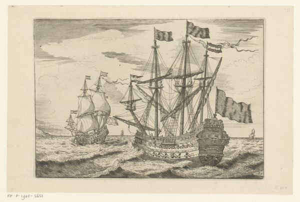
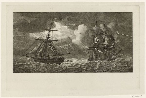
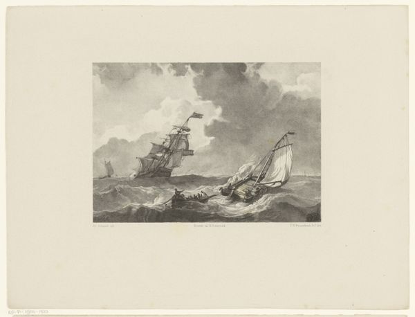
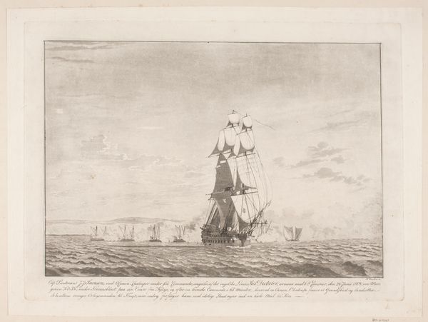
Curator: Welcome. Before us hangs J.F. Clemens' aquatint, “Suite af skibe. Fregat,” dating roughly from 1748 to 1831. A ship at sea is caught between a slightly wavy ocean and clouded sky. Editor: There's an understated elegance to this image. The soft grays, achieved through the aquatint technique, imbue it with a kind of wistful atmosphere. The texture in the sky contrasts appealingly with the smooth sails of the vessel. Curator: Indeed, aquatint allowed for tonal gradations that were a significant development for printmaking. Prints such as this became vital tools for disseminating images of naval power and trade. How the Dutch or British or even Danish empires projected power was through imagery. Editor: Note the subtle rendering of light. The way it catches the sails, implying their fullness, speaks volumes. There's real care in modeling the curves of the hull, too, and look how they use subtle, almost invisible gradations of ink tone, which provide an atmospheric scene overall. Curator: It certainly presents an idealized vision. Consider who the primary audience would have been for these prints: educated, affluent men with an interest in the world’s trade routes and empires. They want this image and to consider a well managed machine of power and authority. The vessel’s purpose might be a projection of what is believed about maritime industry and the power of globalization. Editor: Agreed, but regardless of what the commissioner or patron would want to get from this picture, in that sea of light, shadow and tonality, Clemens seems to suggest an almost melancholic mood, an acknowledgement of time passing. Curator: I find your interpretation very insightful! Looking at how a common print like this was interpreted during its own time and now in our time shows its continuous cultural power and its unique message through different eras. Editor: The texture gives an idea about its beauty and how the artwork captures attention despite its simplicity.
Comments
No comments
Be the first to comment and join the conversation on the ultimate creative platform.
More like this