graphic-art, print, typography, poster
#
graphic-art
# print
#
constructivism
#
soviet-nonconformist-art
#
text
#
typography
#
geometric
#
abstraction
#
poster
Copyright: Public domain US
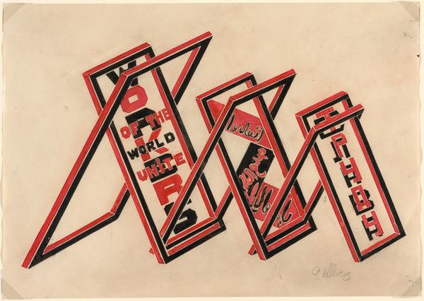
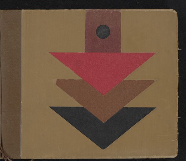
Alexander Rodchenko made this book cover, Fly. Avia-poems., in 1923, likely using gouache and paper. The design feels almost like it’s been assembled, you know, like it’s built up with pre-existing pieces, like a collage or a very stylized blueprint. What really gets me is the way Rodchenko uses color and shape to create these very dynamic layers. The contrast between the red and black against the neutral background, it's so bold. And that airplane at the top, it's not trying to be realistic, it’s more about the idea of flight, like a symbol that’s been put together. Look at how he uses lines and flat shapes to suggest depth and movement, especially within that central triangle. There's a sense of optimism here, which reminds me of other constructivists like El Lissitzky, who were exploring similar themes. It's like they're all having a conversation about the future, and how art can be a part of building it.
Comments
No comments
Be the first to comment and join the conversation on the ultimate creative platform.
More like this