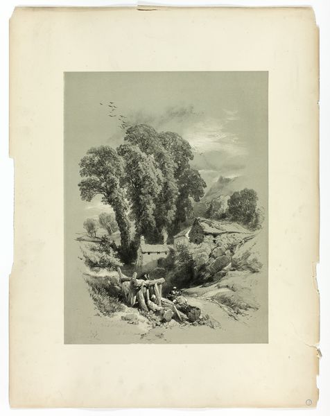
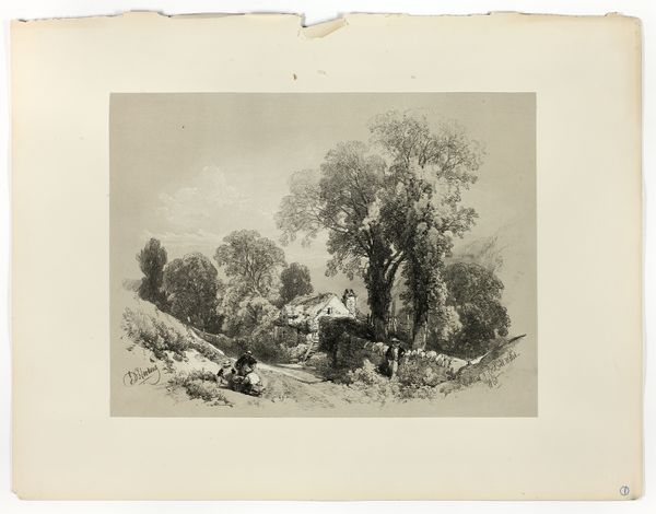
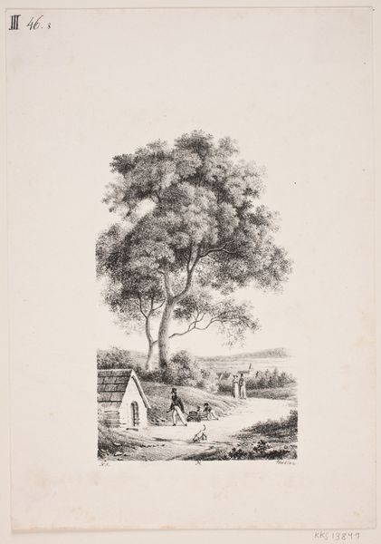
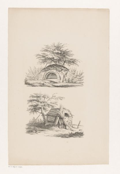
At Dorking, from Picturesque Selections c. 1859 - 1860
0:00
0:00
Dimensions: 380 × 282 mm (image, primary support); 560 × 430 mm (secondary support)
Copyright: Public Domain
Curator: This lithograph, “At Dorking, from Picturesque Selections,” was created by James Duffield Harding around 1859 or 1860. It’s currently held right here at the Art Institute of Chicago. Editor: My first thought? It feels utterly, beautifully Victorian… that misty quality, a romantic haze over very real working life. You can almost smell the damp earth and hay. Curator: Absolutely. Harding was a master of imbuing landscapes with feeling. Look at the textural details he achieves with lithography; it almost mimics the grain of the wood in those rustic buildings. I see a subtle tension between romanticism and realism in the way it focuses on the scene, wouldn’t you say? Editor: I do, and it makes me wonder about the labor involved in creating and distributing prints like these. Each one would have required careful crafting of the lithographic stone, not to mention the physical demands of printing. Did Harding consider that a form of honest work that also defined romantic vision? Or how many hands helped with pulling each print off the press, I'd like to know the division of labor on one print, alone! Curator: That's a wonderful perspective. Harding would have likely seen printmaking as an extension of the landscape tradition. The idea of “Picturesque Selections” suggests a curated, idealized view. However, your idea draws attention to the means of reproduction and the layers of work it takes to build our realities. It forces us to consider who is missing, who's just outside the frame! Editor: Right. Those buildings aren’t just quaint structures; they're built, used, and likely owned. It pushes back, just a little, against the pure romanticism that erases any questions of labour from that era. I do think Harding also wanted us to consider it, somewhere along the line. I bet that this particular piece would have required a great deal of planning just to achieve a sense of artistic serendipity. Curator: I love how the composition directs the eye. Those figures near the bottom pull us in before drifting into the copse of trees. It makes the scale almost seem massive, even though it’s just on paper! Thank you for shedding your view and focus on how we should continue looking, not just at, artwork. Editor: Of course! We bring our history, experiences, knowledge about materials and context to whatever art speaks to us. And how we use what it has to say is how we really bring art to life.
Comments
No comments
Be the first to comment and join the conversation on the ultimate creative platform.
More like this