1888
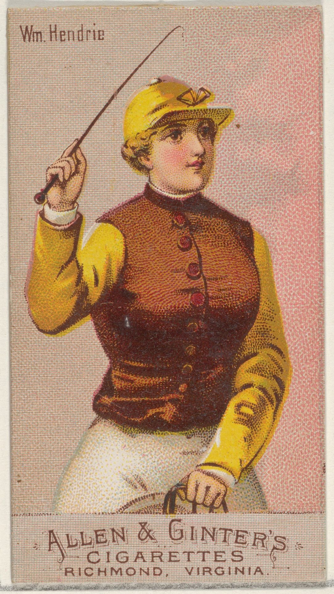
William Hendrie, from the Racing Colors of the World series (N22b) for Allen & Ginter Cigarettes
Listen to curator's interpretation
Curatorial notes
Curator: This diminutive card presents William Hendrie, an equestrian figure extracted from Allen & Ginter's "Racing Colors of the World" series. The year is 1888. Note how the rigid pose, a certain flatness in the application of colour, gives the work its peculiar charm. Editor: Charm is one word for it, I guess. But does anyone else feel an…awkwardness? Something about the scale or maybe the subject's stiff, upright posture…It’s giving me a bit of a "fish out of water" vibe. A jockey promoting tobacco? The connection is, shall we say, less than equestrian! Curator: The "awkwardness," as you put it, perhaps derives from a tension between portraiture and commerce. The semiotic field established by this fusion reveals the evolving dynamics of leisure, sport, and nascent brand culture. One observes a Japonisme influence in the aesthetic of miniature and flatness, further highlighting this complex discourse. Editor: Right! And there is definitely a blend of formal portraiture and what looks like very subtle caricature…Did the artist capture some unexpected truths? And if so, are those “truths” in harmony with the product Allen & Ginter was trying to promote? What about the colored-pencil technique, especially that muted palette…are those formal techniques acting in harmony, or pulling against each other in ways that speak to conflicting class values, even a tension between masculinity and dandyism? I mean, let's be honest. Cigarette cards for jockeys seems really random. Curator: A valid assessment, which opens paths to decoding the layered symbolisms and underlying ideological apparatus at play. What about the color choices; this palette establishes its own internal logic. Editor: You know what’s also intriguing? The way he holds that whip. Not exactly ready for the race, is he? It’s more like a fashion accessory! The composition gives me the sense the artist wants me to think something besides, 'fast horses' and 'thrilling races'! And now I understand: The drawing is saying as much about the culture of cigarette cards as the person whose image it puts on display. Curator: Precisely! And by extension, ourselves too, perhaps? This is the brilliance, however oblique, that speaks across the years. Editor: Agreed. It started out awkwardly charming but now it speaks to us anew. What's not to like about that?