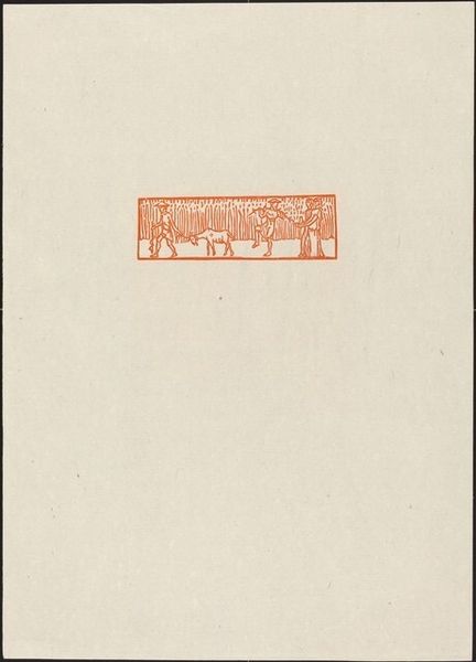
graphic-art, print, typography, engraving
graphic-art
art-nouveau
pattern design
typography
fabric design
decorative-art
engraving
calligraphy
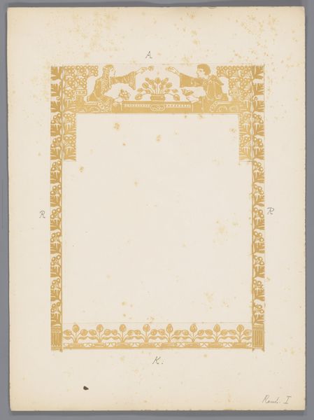
Dimensions: height 414 mm, width 295 mm
Copyright: Rijks Museum: Open Domain
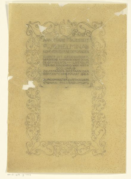
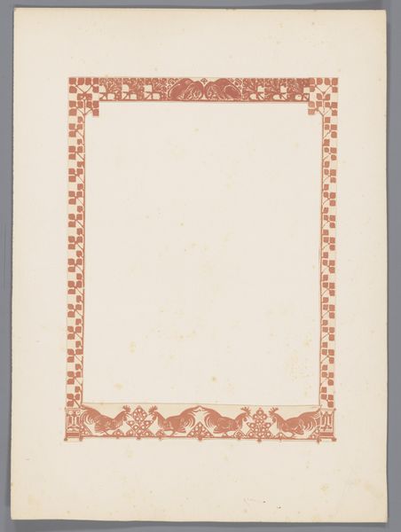
Curator: The work before us is titled "Rey van klaerissen", an engraving with typography, by Antoon Derkinderen, created sometime between 1894 and 1901. Editor: It strikes me immediately as a very formal piece. The symmetrical layout and elegant calligraphy give it a sense of old-world decorum. There’s a certain weight, a gravity implied despite its delicate appearance. Curator: Indeed. This print is evocative of late 19th-century decorative arts, notably Art Nouveau and a revival of interest in medieval styles. Derkinderen situated himself amidst movements seeking to restore artistry to everyday objects. This engraving would've likely functioned as a kind of emblem or title page. Editor: You can see how these aesthetics were wrapped up in ideas around morality, religion, and a broader cultural return to tradition in reaction to the rapidly changing world at the time. The visual order conveys a deeper philosophical or societal desire for harmony. How do we contextualize Derkinderen's decisions here? Curator: We might consider how the Dutch art scene responded to industrialization, often looking back to an imagined idealized past. The lettering itself pulls from traditions of illuminated manuscripts, while the decorative motifs hint at both Christian symbolism and secular heraldry. The piece appears as if claiming history in service of modern design, blurring the lines between craft, fine art, and mass production. Editor: Do you read something interesting into the choice to include the Eucharist? One wonders whether that symbolizes specific politics around spiritual life that may reflect ideas related to control. In some ways it feels patriarchal. Is the artist grappling with issues such as gender? Curator: Potentially. However, I am curious as to what end his grappling occurred. I think unpacking these details could suggest many ways that social tension played out. The "Rey van klaerissen", it speaks both to a desire for visual beauty, perhaps with undercurrents from that cultural moment’s anxieties and hopes. Editor: Right. Seeing how these forms circulate now – as reproductions – underscores the complexities of artistic intention and reception across historical divides. The piece reveals so much about Derkinderen, and us. Curator: Precisely. Thank you for that enriching dialogue, providing an important view of art and its interaction in the world around it.
Comments
No comments
Be the first to comment and join the conversation on the ultimate creative platform.