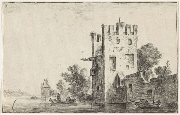
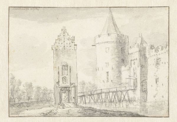
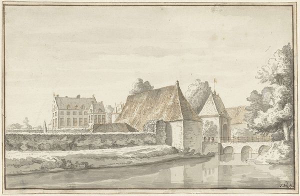
drawing, ink, pen
#
drawing
#
aged paper
#
quirky sketch
#
baroque
#
mechanical pen drawing
#
old engraving style
#
sketch book
#
landscape
#
personal sketchbook
#
ink
#
sketchwork
#
pen-ink sketch
#
pen work
#
pen
#
cityscape
#
storyboard and sketchbook work
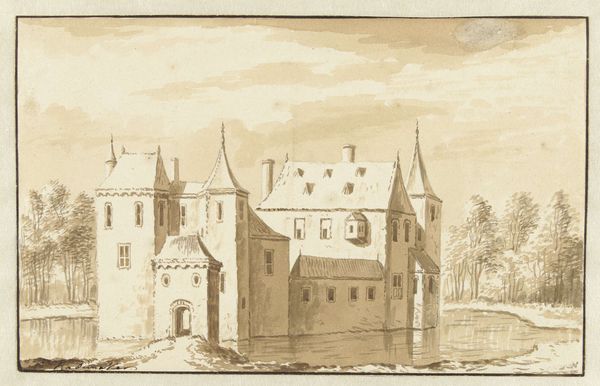
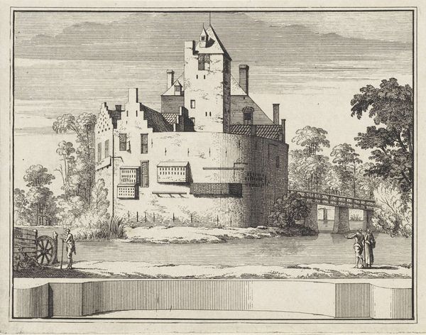
Dimensions: height 123 mm, width 185 mm
Copyright: Rijks Museum: Open Domain
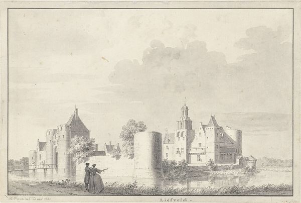
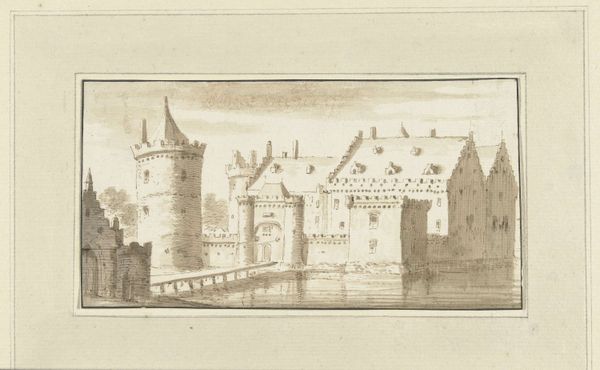
Editor: This ink and pen drawing, titled "Het kasteel Groenewoude bij Woudenberg (?)" by Jacobus Stellingwerff, likely dates from the late 17th or early 18th century. There’s something so immediate and personal about this little cityscape; it reminds me of the architectural studies I do in my own sketchbook. What details jump out at you when you see it? Curator: It evokes a sense of cultural memory, doesn’t it? These aren’t just lines on paper; they’re echoes of status, defense, and perhaps even idealized domesticity, filtered through the lens of the artist. How does the depiction of water surrounding the structures resonate with you? Editor: I hadn't thought of it like that, but the water makes it feel isolating. Is that a typical representation of castles from that time, or might it suggest something about the people who lived there? Curator: The water absolutely serves a practical function, reflecting defense and controlled access. But, thinking symbolically, water is so often linked to purification and the subconscious. Look at how the delicate pen strokes capture the reflections. It begs the question, what is the artist revealing, consciously or otherwise, about the inner world connected to this external fortress? Editor: So the drawing operates on multiple levels, capturing both the literal appearance and a symbolic interpretation of the castle. Curator: Precisely. It encourages us to consider how seemingly straightforward depictions can be layered with cultural and psychological weight. Do you see a specific mood that arises from the composition? Editor: The stark lines give it a detached, almost clinical feeling. But, also it has this haunting quality, like a dream fading away. Curator: An intriguing combination! That tension speaks to the power of images to be both objective records and deeply personal expressions, shaping how we remember and understand the world around us. Editor: I'll definitely remember to look beyond the surface details from now on, and think about the broader cultural context behind an image. Curator: And I’ll strive to appreciate the blend of fact and emotional undertones in seemingly "clinical" artworks.
Comments
No comments
Be the first to comment and join the conversation on the ultimate creative platform.
More like this