drawing, paper, ink
#
portrait
#
drawing
#
script typography
#
hand-lettering
#
ink paper printed
#
hand drawn type
#
feminine typography
#
hand lettering
#
paper
#
ink
#
hand-drawn typeface
#
ink drawing experimentation
#
intimism
#
calligraphic
#
pen work
#
calligraphy
Copyright: Rijks Museum: Open Domain
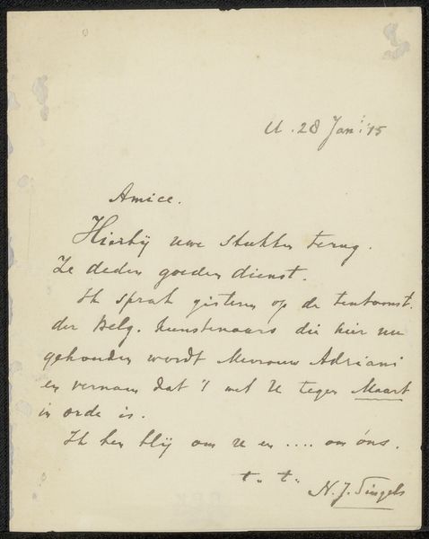
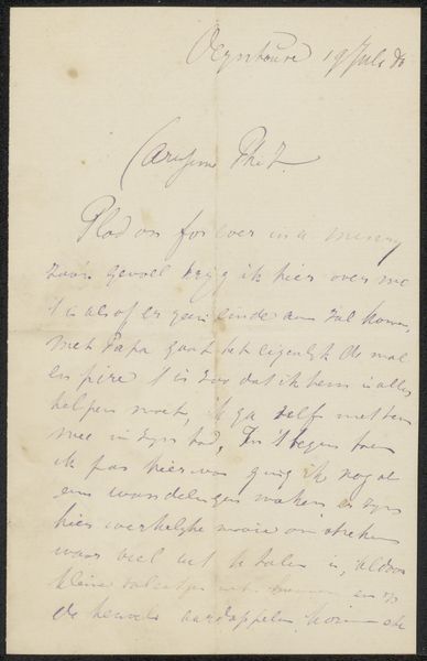
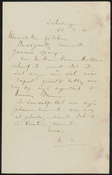
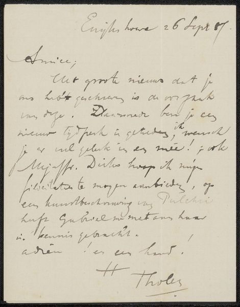
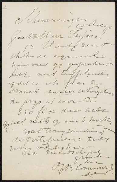
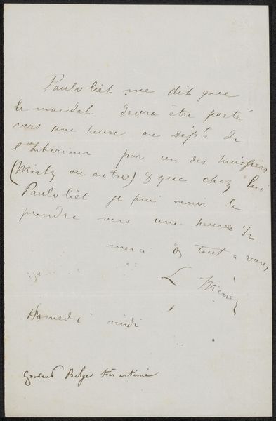
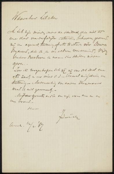
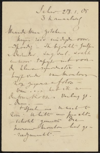
Curator: Before us is “Brief aan Philip Zilcken” by Hendrik Johannes Haverman, created sometime before 1923. It’s a drawing in ink on paper currently held at the Rijksmuseum. Editor: My first thought is intimacy; there’s something deeply personal about seeing someone’s handwriting, especially when it looks like a quickly jotted note. Curator: Absolutely, the texture created by the ink on the paper is rather nice. There's a clear attention to the flow and rhythm of the lines themselves, a deliberate attempt to imbue the words with an aesthetic quality. Editor: I wonder about the context of the letter itself. Who was Philip Zilcken, and what was the nature of his relationship with Haverman? The "Vrijdag v.h." suggests it might have been part of a regular correspondence, perhaps even business related. Curator: Semiotically speaking, the writing itself acts as both message and medium, defying a clear distinction between the two. The loops and curves of each letter convey as much meaning, maybe more, as their literal content. It suggests this was not merely utilitarian, but valued on its aesthetic appeal. Editor: The mention of "etsspereo" sounds like etching materials in a casual check-in, indicative of shared professional interests, and potentially offering insight into artistic communities of the period. The "pers" might be a printing press they use, indicating the letter involves project-related coordination. Curator: I am very keen on its materiality—how the light reflects on the page, emphasizing both the ink's texture and the almost aged surface. It adds a layer of tactile quality. It really feels like we have something tangible from the past. Editor: Thinking of it from an art market perspective, how this was likely regarded then and how we regard it now, really drives its appeal to us today. Once purely functional, its value now lies in it offering access to an artist's thought processes, artistic interactions, or, even to some degree, to intimate relations in their era. Curator: Precisely, by reducing communication into shapes of lines that fill spaces it gives us the power of raw feeling without any representation from subject matter and without obvious iconography. It also challenges common conceptions about how much artistic expression relies almost exclusively with skillful mastery or meticulous craft. Editor: So while the work isn’t particularly grandiose, its intimate glimpse into history provides, for me, a tangible point of connection to the past. Curator: I see that in a refined expression of Haverman’s sophisticated aesthetic principles, with script alone forming a microcosm that challenges preconceived assumptions and is open to new perspectives.
Comments
No comments
Be the first to comment and join the conversation on the ultimate creative platform.
More like this