mixed-media, textile
#
mixed-media
#
contemporary
#
textile
#
abstraction
#
abstract art
Copyright: Claudio Bravo,Fair Use
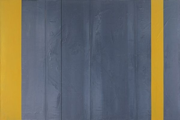
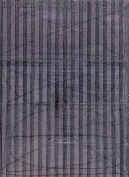
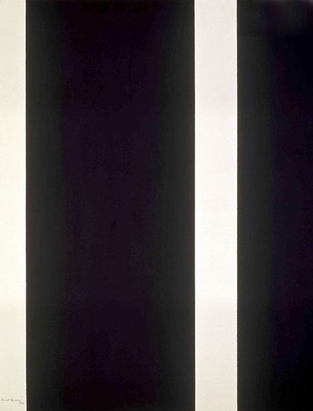
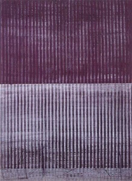
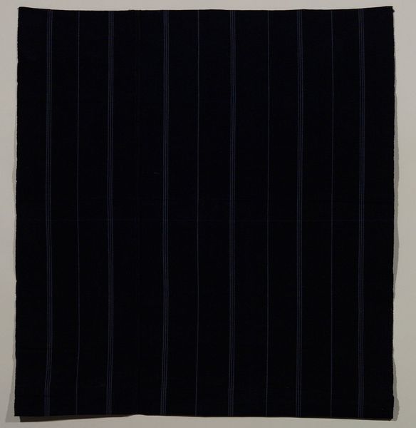
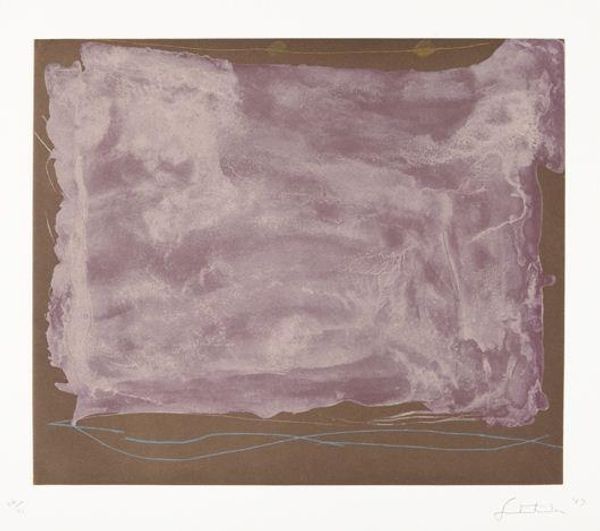
Editor: This is Claudio Bravo's "Vendredi Saint" from 1998, crafted using mixed-media including textiles. The triptych, with its dominant violet hue, presents such intriguing folds and shadows. What catches your eye, what do you see? Curator: Its arrangement commands visual hierarchy. The symmetrical framing gives way to a centralized, static panel. Notice how Bravo manipulates the surface—the textural tension created by the creases and folds activates a discourse between light and form. This manipulation is essential, wouldn’t you agree? Editor: Absolutely, the almost sculpted appearance creates an interesting dynamic. The materiality, although textile, gains weight. The flat central panel is distinctively separate. Curator: Precisely. Bravo’s control of line and form imbues the artwork with a kind of formal restraint. Its stillness is less about representation and more about investigating texture, colour, and ultimately, the physical properties of art itself. What theoretical lens would you bring to bear on the colour selection? Editor: I hadn’t thought of the colour as such a structural aspect! Thinking about colour theory, this specific hue lends the artwork a subdued sense of depth and dimension, the darker recesses appearing so dense and velvety. I would not have considered the choice being fundamental. Curator: The structure predicates everything. The composition becomes an argument about visual balance, and its success relies on its internal logic. Editor: Thank you! I’ll consider colour and compositional choices so much more deliberately now. Curator: And I will continue to see the value in representational content. A worthy exchange.
Comments
No comments
Be the first to comment and join the conversation on the ultimate creative platform.
More like this