Copyright: Public domain
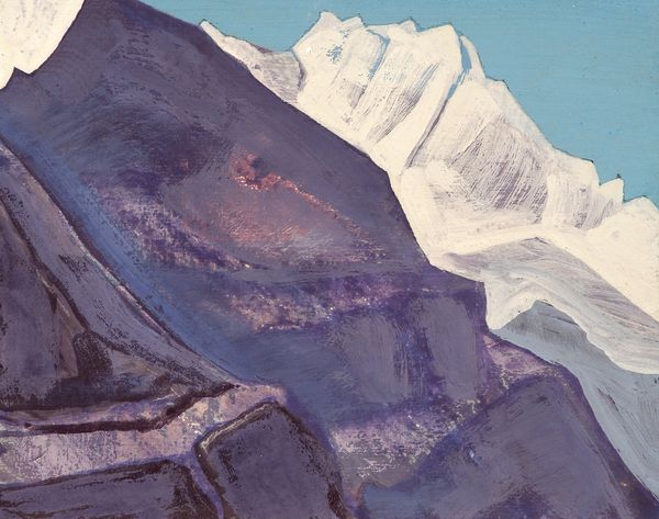
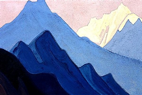
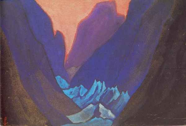
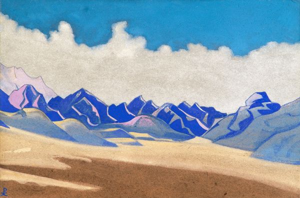
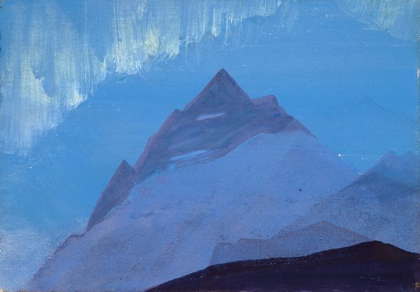
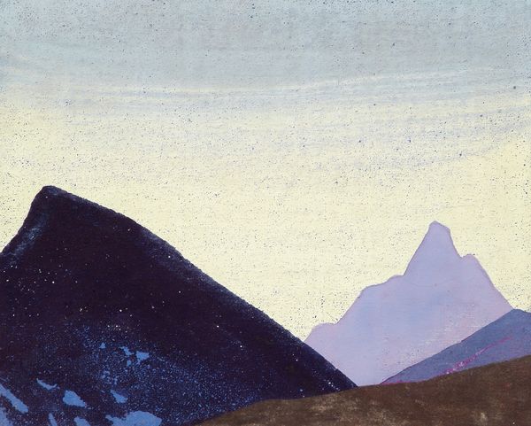
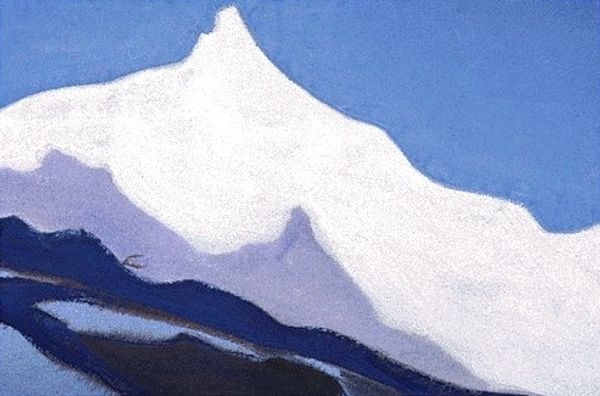
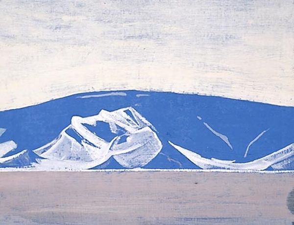
This blue vision of the Himalayas is one of a huge series of paintings Roerich made of these mountains. The paint application is pretty direct, and the colour palette is limited to a few shades of blue, which really emphasises the process of painting, of laying colour onto a surface. I love how Roerich creates these monumental forms with simple blocks of colour. The paint isn’t too thick, but it has a definite presence on the canvas, creating a slightly rough texture. Look at the way he defines the peaks and ridges with dark blue outlines, it reminds me of stained glass or even a slightly naff travel poster, but that’s also part of its charm. There's a kind of humble quality in the process of making it, in the directness of the marks and the honesty of the brushwork. Roerich's interest in simplified forms and spiritual themes reminds me of Hilma af Klint, though her work has a totally different feel, the shared interest in these themes is fascinating. These paintings aren’t trying to be definitive statements, and they embrace ambiguity, which is part of what makes them so appealing.
Comments
No comments
Be the first to comment and join the conversation on the ultimate creative platform.
More like this