painting, oil-paint
painting
oil-paint
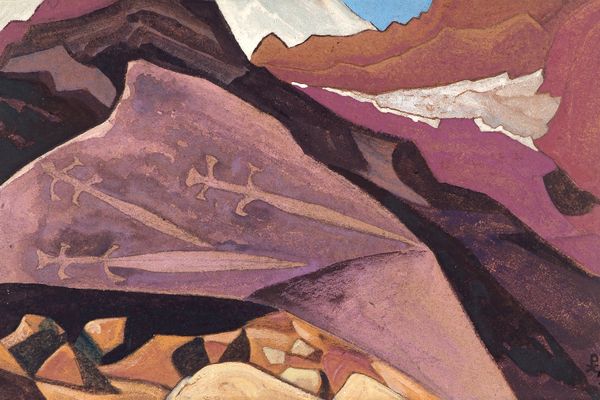
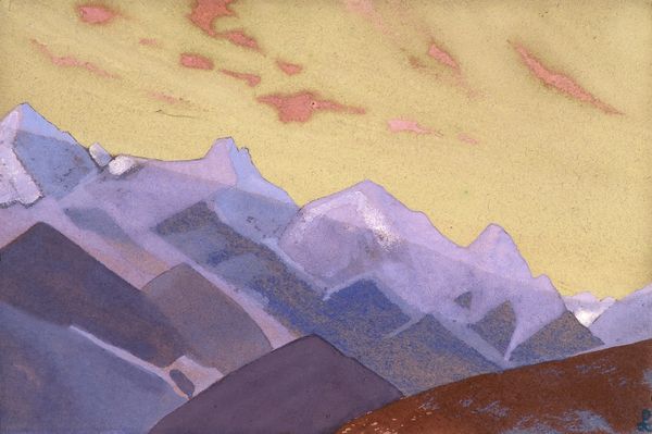
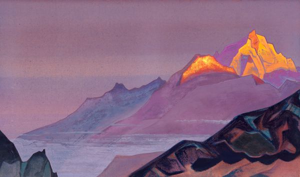
landscape
soviet-nonconformist-art
oil painting
mountain
modernism
Copyright: Public domain
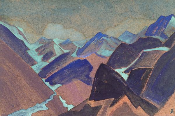
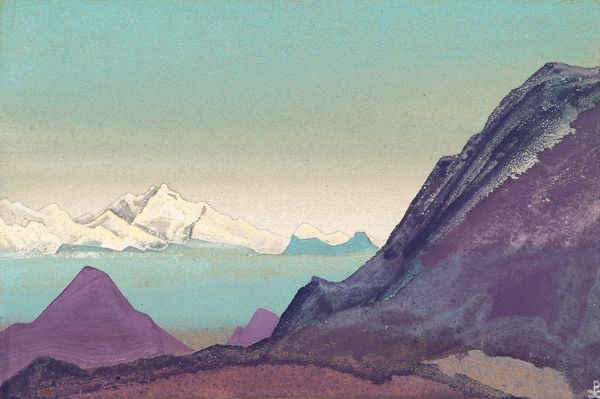
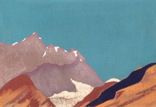
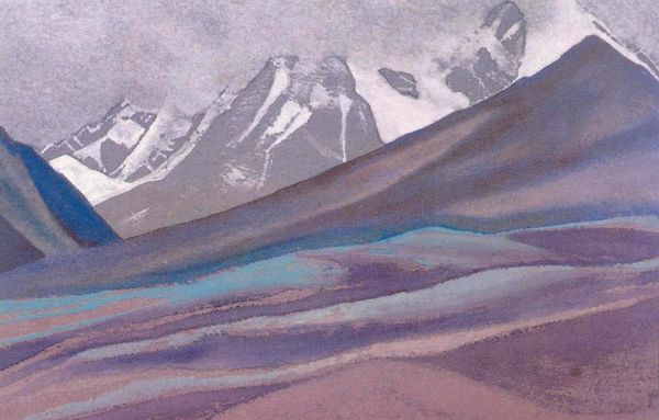
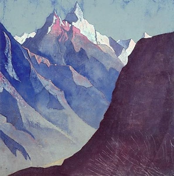
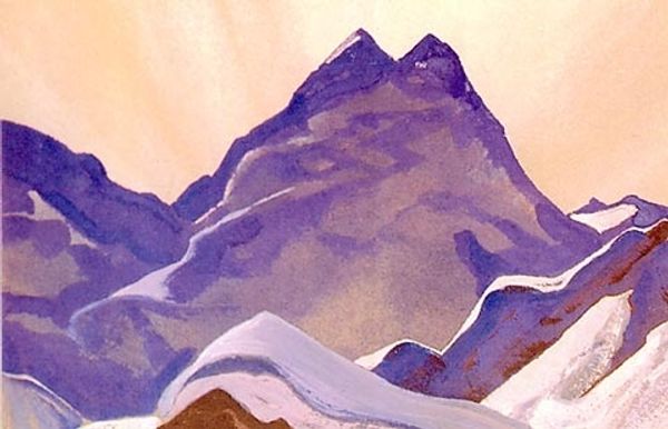
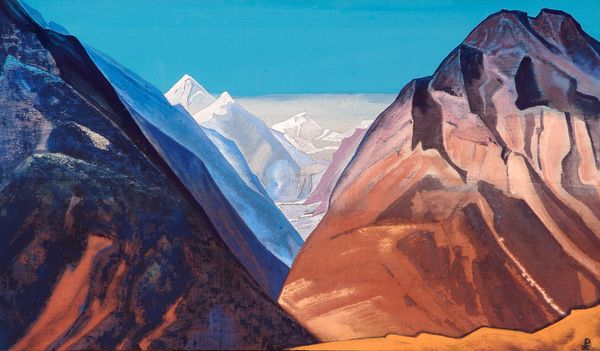
Editor: Here we have Nicholas Roerich's oil painting, "Study of Mountains," from 1933. There's a certain solidity to these mountain forms, but the colours – a lot of purples and blues – make it feel almost dreamlike. What do you see in this piece? Curator: Primarily, I'm struck by the structural simplicity Roerich employs. The composition hinges on a juxtaposition of planes – the solid, block-like forms of the mountains themselves, layered against the flat expanse of the sky. It’s a calculated reduction of nature to its essential geometry. Note the brushwork as well; each stroke is distinct, building up a textured surface that emphasizes the materiality of the paint itself. Editor: So, you are suggesting it’s less about realistic representation and more about… the paint? Curator: Precisely. The representational aspect is secondary. The oil paint doesn’t try to mimic a mountain, but instead presents its own tangible reality. And the color isn’t descriptive as much as evocative. Consider how Roerich utilizes the varying hues of blue, purple, and the stark white of the snow to delineate the different facets, thereby rendering spatial depth within the canvas. How would you describe the spatial rendering in this painting? Editor: It’s not realistic at all. It almost looks like it's stacked one thing on top of another. It's more about feeling, maybe a symbol. Curator: Yes! Form triumphs over verisimilitude. This focus on shape, color, and brushstroke—it speaks volumes. Roerich invites the viewer into a purely visual encounter, stimulating aesthetic sensation through artistic means. Editor: I didn't consider it that way, but I can appreciate his skillful use of form and color. It makes it seem quite abstract despite its seemingly straightforward subject matter.
Comments
No comments
Be the first to comment and join the conversation on the ultimate creative platform.