Copyright: Creative Commons NonCommercial
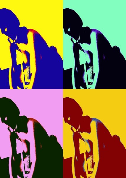
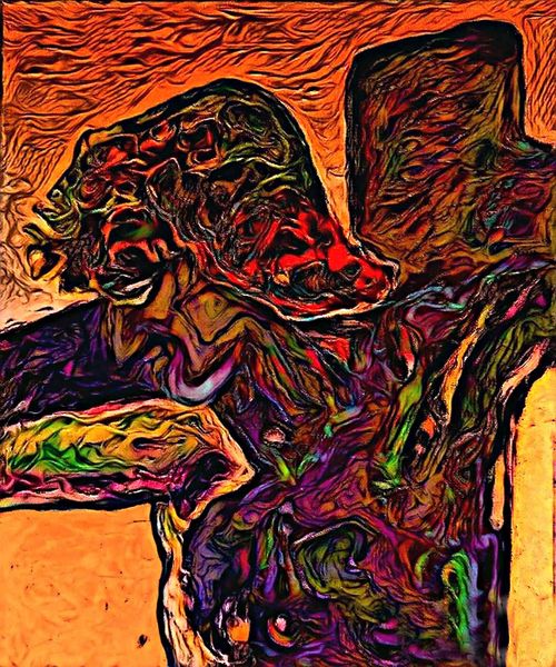
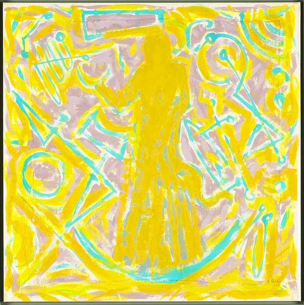
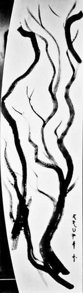
Curator: Alfred Freddy Krupa created this acrylic work entitled "In my room or NSFW (III)" in 2016. The piece presents a divided canvas, each section awash in different bright hues. Editor: Immediately, I'm struck by its visual loudness. The stark contrasts and compartmentalized blocks of color feel intentionally disruptive, almost aggressive. What's your read on the composition? Curator: The structure certainly prioritizes division. Consider the grid-like arrangement—each quadrant, defined by those saturated colors, functions almost as an individual canvas, a self-contained plane for visual exploration. This segmented approach breaks any possibility of linear narrative. Editor: Yet, within each of these supposedly distinct "canvases", we see recurring forms. Branch-like lines and dark, central areas echo throughout. Is there perhaps an underlying symbol or repeated motif tying this visual cacophony together? It's as though he is working through one symbol through these different tonalities. Curator: Precisely. The chromatic scheme almost feels secondary, designed to highlight the repetition. It becomes evident these fractured shapes, set against backgrounds of such varied tones, are perhaps the essence of the piece. Krupa pushes the forms through variations in hue and saturation, each echo changing based on it’s background plane, modifying their inherent shape through color, value and contrast relationships. Editor: Could these shapes allude to the 'NSFW' portion of the title? Considering our cultural encoding of particular symbols, one wonders about his choices, or lack thereof, for the various colors to heighten the potential symbols. This is echoed again with the notion of "In my room," leading me to view this from the viewpoint of his subjectivity. Curator: An intriguing angle! Shifting beyond formal arrangement, if we consider a symbolic interpretation, the repeated motif—its organic, almost vascular appearance—could become a key element of the intended, deeply personal, messaging behind it all. He seems to use the repetition and change of the figures to explore various versions of the truth, each dependent upon color and, as you indicated, a personalized view of this truth. Editor: And in conclusion, these shifting readings only deepen the artwork's complexity, suggesting a world that is as mutable and emotionally potent as Krupa's color choices here. Curator: Indeed, moving beyond mere structural analysis and leaning towards its intrinsic personal value for Krupa makes it something really amazing.
Comments
No comments
Be the first to comment and join the conversation on the ultimate creative platform.
More like this