drawing, coloured-pencil, print, watercolor
#
drawing
#
neoclacissism
#
coloured-pencil
#
water colours
# print
#
landscape
#
vase
#
form
#
watercolor
#
coloured pencil
#
geometric
#
line
#
decorative-art
Dimensions: sheet: 11 3/4 x 7 5/8 in. (29.8 x 19.4 cm)
Copyright: Public Domain
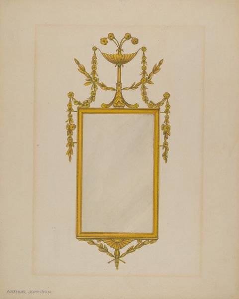
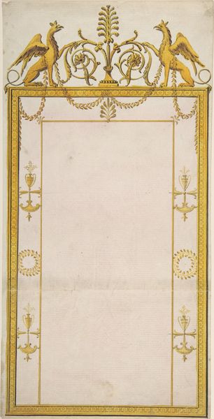
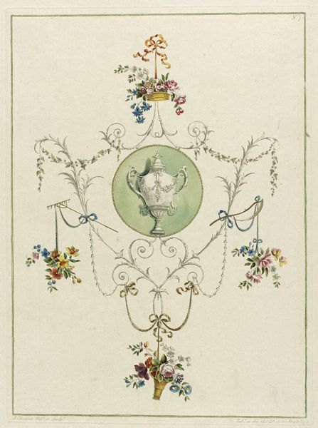
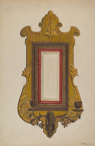
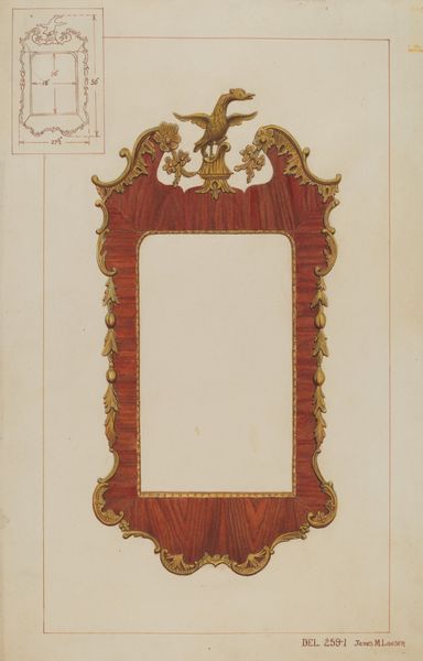
Curator: This drawing, titled "Design for a Mirror Surmounted by a Vase," comes to us from the hand of John Yenn, dating approximately from 1770 to 1821. It resides here at the Metropolitan Museum of Art. It employs watercolours and coloured pencils with exquisite precision, evoking a refined Neoclassical aesthetic. Editor: It has a kind of austere beauty. The colours are so restrained, and the symmetry so precise. There's a formality to it that almost feels cold, yet the decorative elements hint at luxury and craft. Curator: Indeed, it is worth considering this object beyond pure design. How does the depicted vase atop the mirror operate within a network of luxury and consumption? The craft involved points to the social standing that would own and produce such items, highlighting a whole system of production. Editor: Well, strictly from a visual standpoint, the way the artist has arranged these classical motifs - the laurel wreath, the vase, the symmetrical frame - is masterful. The drawing offers a lesson in balance, proportion, and the interplay between line and form. Curator: Yes, the harmony is intentional. Yenn understands the language of status conveyed through this proposed mirror's materials: imported marble, perhaps Venetian glass. What social structures make this mirror design viable or desirable? Who benefits from its production? Editor: I can appreciate that the clean lines and geometric forms suggest reason and order. The colour palette, those pale blues and creams, adds to that sense of harmony, resulting in something that feels entirely balanced and complete, irrespective of any other context. Curator: And those seemingly simple colours involve extensive labor and expensive pigments available to few! This piece points us to the industrial aspect of interior design from this time period: what materials were most fashionable, and why? How were workshops designed to accommodate this labour? Editor: Perhaps. However, seeing it purely in terms of the relationship between those constituent shapes – squares, circles, ellipses – shows how Yenn has taken very basic forms and combined them to make something incredibly sophisticated and graceful. It almost seems the artist took pleasure in showing off their grasp of compositional possibilities. Curator: Interesting, that we interpret it differently: the 'pleasure', in my interpretation, belongs to the consumer, not just the artist; the end user who relishes in these signs of refined style in their Neoclassical homes. Editor: An intersection point. We meet again with formalism and materialism as we seek to appreciate works.
Comments
No comments
Be the first to comment and join the conversation on the ultimate creative platform.
More like this