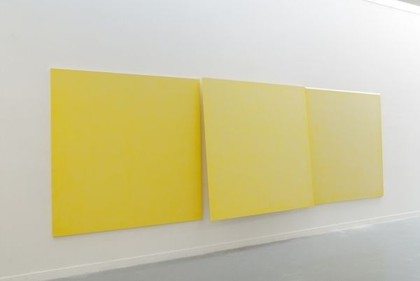
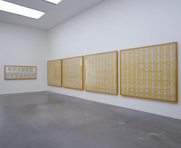
Blind No. 20, Seventeen-foot high Ceiling or Lower, Historical Van Dyke Brown, Historical Veridian Green, Indian Yellow Hue, Hansa Yellow Medium (to Mike Kelley) 2012
0:00
0:00
Copyright: Stephen Prina,Fair Use
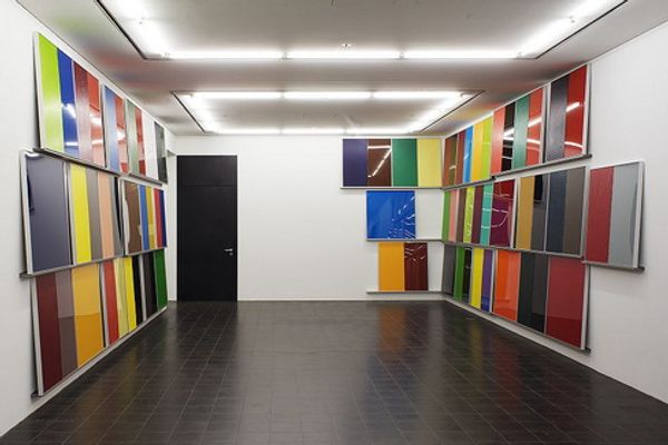
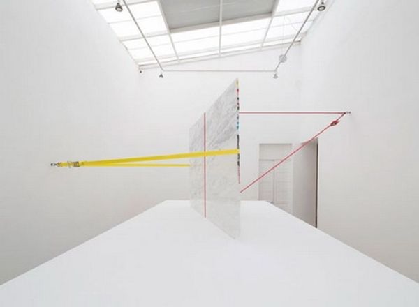
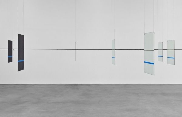
Curator: Stephen Prina created this mixed-media installation in 2012. The title is quite a mouthful: Blind No. 20, Seventeen-foot high Ceiling or Lower, Historical Van Dyke Brown, Historical Veridian Green, Indian Yellow Hue, Hansa Yellow Medium (to Mike Kelley). Editor: My first impression is one of architectural interruption. These suspended panels painted with gestural marks divide and complicate the gallery space. They force the viewer to navigate around them, experiencing the room differently. Curator: Prina's choice of color here is fascinating. Van Dyke Brown has traditionally symbolized earthiness and humility, while Veridian Green can evoke nature and renewal. The bright yellow piece in the background reminds me of the golden light associated with enlightenment. Editor: Structurally, the repetitive brushstrokes establish a clear rhythm. Notice how the texture almost dematerializes the panels, blurring the distinction between painting and sculpture. There's an interesting tension between the ordered rows and the organic nature of the marks themselves. It challenges the supposed objectivity of formal abstraction. Curator: Absolutely. The dedication “to Mike Kelley” suggests a dialogue with Kelley’s own explorations of repressed memory and trauma, using familiar visual symbols. These colors are almost textbook, and the simple sweeping shapes might stand in for childlike or primitive markings. Are we looking at an attempt to excavate layers of personal and cultural meaning? Editor: I see that. It makes me rethink the panel's imposing scale. It’s less about pure aesthetics and more about using materiality and form to trigger psychological or cultural associations in the viewer. The simple shape creates complex depths of field within the architecture. Curator: This piece has been insightful to delve into. Looking at the history of these colors gives you an emotional sense and context for the artist's creative work. Editor: Yes, the seemingly straightforward arrangement becomes something deeply rich when considering not just how but why the structure, material, color and surface manifest.
Comments
No comments
Be the first to comment and join the conversation on the ultimate creative platform.
More like this