About this artwork
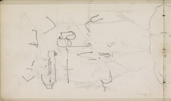
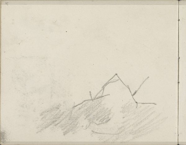
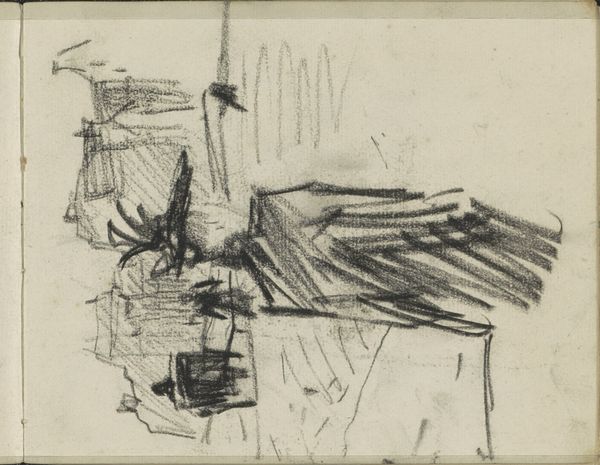
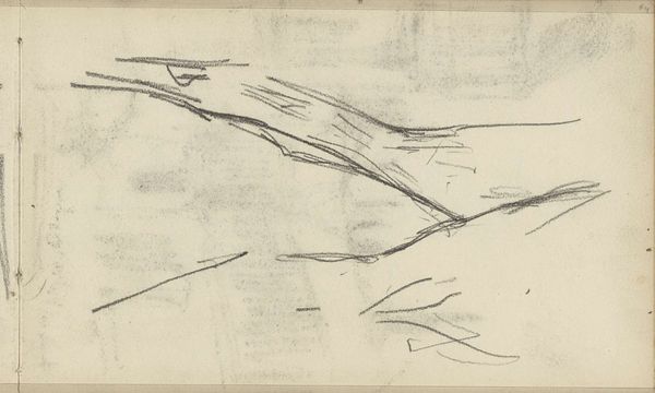
Curator: Breitner's "Figuur op straat," created sometime between 1886 and 1903, strikes me with its stark, almost brutal simplicity. Editor: Indeed, there's a raw immediacy. The composition is barely there – the figure a flurry of lines, practically dissolving into the background. Curator: The figure becomes less about the individual and more about the experience of observing an environment during rapid urbanization, an idea which speaks to class division as people are forced from their rural existence into crowded city centers. This piece speaks volumes about the realities of marginalised communities. Editor: That's fascinating, but aesthetically, the contrast is striking. The figure rendered with frantic energy against the vaguely defined, almost dissolving urban backdrop. The artist’s quick pencil strokes build texture but do not coalesce to define form – almost a deconstruction, a kind of visual semiotics in its reduction of subject matter. Curator: That technique Breitner uses mirrors the disorientation and displacement so many experienced during that period. Urbanization led to a severing of communal bonds, reflected in Breitner’s very style, the lack of solidity underscoring this fragmentation. It’s all on toned paper with the suggestion of what amounts to a light pencil sketch, but so deeply affecting! Editor: Affecting because Breitner presents what feels unfinished. We're given this fragment of a person against what we intuit must be their environmental context—there’s an intrinsic incompleteness and vulnerability to the composition and subject. Curator: Looking at Breitner's "Figuur op straat," I see how an artist can expose a complex social and political landscape through minimalistic portraiture, offering space to witness marginalization, identity, and urbanization during industrial capitalism. Editor: And I see the elegance of stark reduction. Its emotive energy, regardless of specific interpretation, hinges on this interplay between frenetic gesture and vacant background space. An exquisite example of formal impact achieved through limited means.
Artwork details
- Location
- Rijksmuseum
- Copyright
- Rijks Museum: Open Domain
Tags
Comments
Share your thoughts
About this artwork
Curator: Breitner's "Figuur op straat," created sometime between 1886 and 1903, strikes me with its stark, almost brutal simplicity. Editor: Indeed, there's a raw immediacy. The composition is barely there – the figure a flurry of lines, practically dissolving into the background. Curator: The figure becomes less about the individual and more about the experience of observing an environment during rapid urbanization, an idea which speaks to class division as people are forced from their rural existence into crowded city centers. This piece speaks volumes about the realities of marginalised communities. Editor: That's fascinating, but aesthetically, the contrast is striking. The figure rendered with frantic energy against the vaguely defined, almost dissolving urban backdrop. The artist’s quick pencil strokes build texture but do not coalesce to define form – almost a deconstruction, a kind of visual semiotics in its reduction of subject matter. Curator: That technique Breitner uses mirrors the disorientation and displacement so many experienced during that period. Urbanization led to a severing of communal bonds, reflected in Breitner’s very style, the lack of solidity underscoring this fragmentation. It’s all on toned paper with the suggestion of what amounts to a light pencil sketch, but so deeply affecting! Editor: Affecting because Breitner presents what feels unfinished. We're given this fragment of a person against what we intuit must be their environmental context—there’s an intrinsic incompleteness and vulnerability to the composition and subject. Curator: Looking at Breitner's "Figuur op straat," I see how an artist can expose a complex social and political landscape through minimalistic portraiture, offering space to witness marginalization, identity, and urbanization during industrial capitalism. Editor: And I see the elegance of stark reduction. Its emotive energy, regardless of specific interpretation, hinges on this interplay between frenetic gesture and vacant background space. An exquisite example of formal impact achieved through limited means.
Comments
Share your thoughts