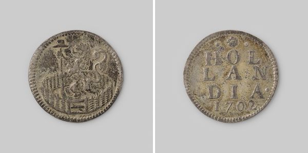
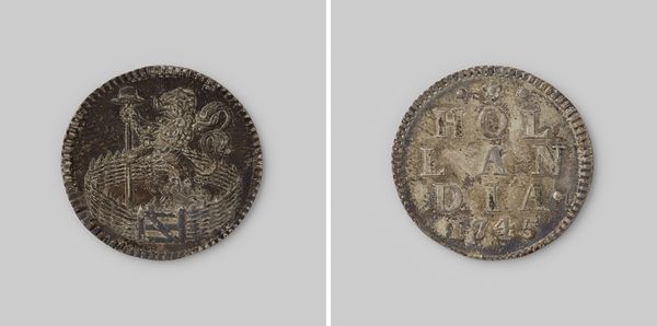
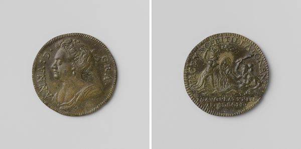
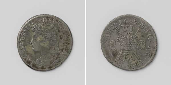
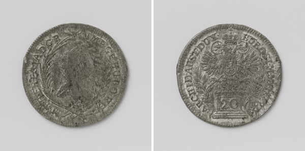
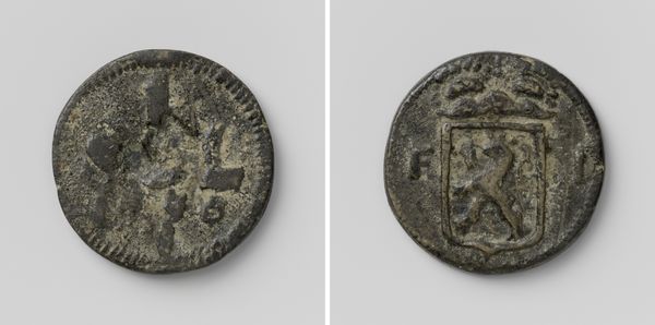
metal, relief, engraving
#
portrait
#
baroque
#
metal
#
relief
#
engraving
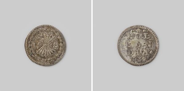
Dimensions: diameter 2.3 cm, weight 3.19 gr
Copyright: Rijks Museum: Open Domain
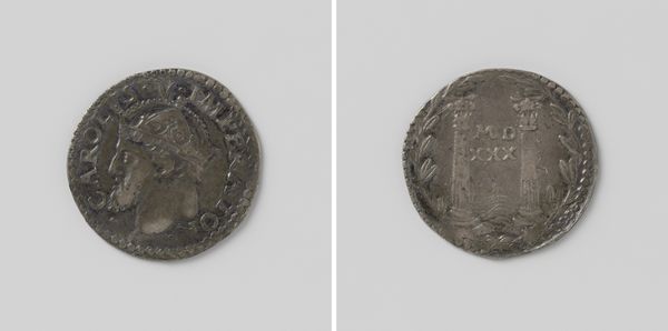
Editor: This is a Dutch "duit", specifically a Hollandse duit from 1744. It's a small, silver coin currently held in the Rijksmuseum. I find the texture fascinating – both the roughness of the coin itself, likely from wear and tear, and the meticulous engraving of the lion and lettering. What do you see in it? Curator: Initially, one observes a bipartite composition, each side offering distinct, yet interrelated visual elements. Side one is dominated by a heraldic lion, rendered with impressive detail given the scale. Consider the linear dynamism created by the lion's posture against the stasis of the enclosure below it. This presents a study in contrasts and balance. Editor: I hadn't thought about it as a study in contrasts. Can you elaborate on how the engraving technique enhances this? Curator: Notice how the engraver varies the depth and density of lines to suggest light and shadow, particularly in the lion's mane and musculature. This creates a sense of depth and volume, making the lion appear almost three-dimensional despite being a relief. Editor: And the other side, with the lettering? It seems less detailed at first glance. Curator: Indeed, but note the considered arrangement of "HOLLANDIA" in a vertical stack, surmounted by a small coronet and punctuated by the date. This creates a visual hierarchy. Also, observe the sans-serif letterforms – a subtle detail suggesting a move toward simplified, legible design, distinct from the more elaborate Baroque flourishes seen in contemporary works. Editor: So even something as utilitarian as a coin reflects evolving aesthetic sensibilities. I will definitely keep this perspective in mind. Thanks. Curator: It's a microcosm of its time, rendered through line, form, and material. Always interrogate the interplay of these elements, and the work reveals itself.
Comments
No comments
Be the first to comment and join the conversation on the ultimate creative platform.
More like this