drawing, print, paper, pen
#
drawing
#
hand written
#
script typography
#
hand-lettering
# print
#
playful lettering
#
hand drawn type
#
hand lettering
#
paper
#
hand-written
#
hand-drawn typeface
#
thick font
#
pen
#
small lettering
Copyright: Rijks Museum: Open Domain
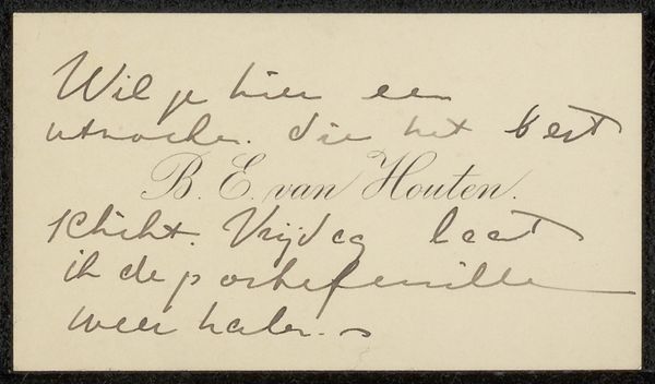
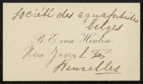
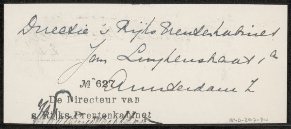
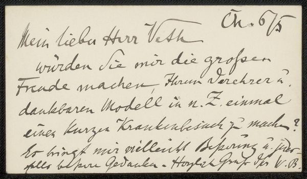
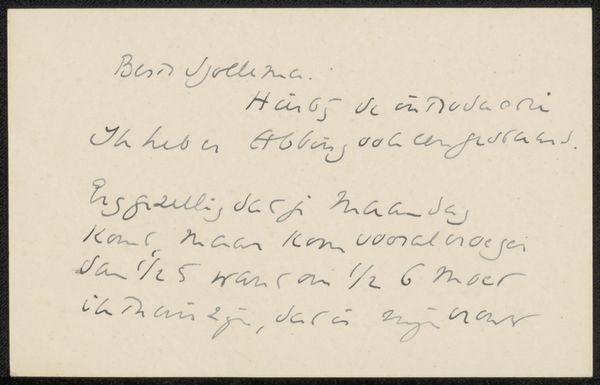
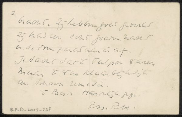
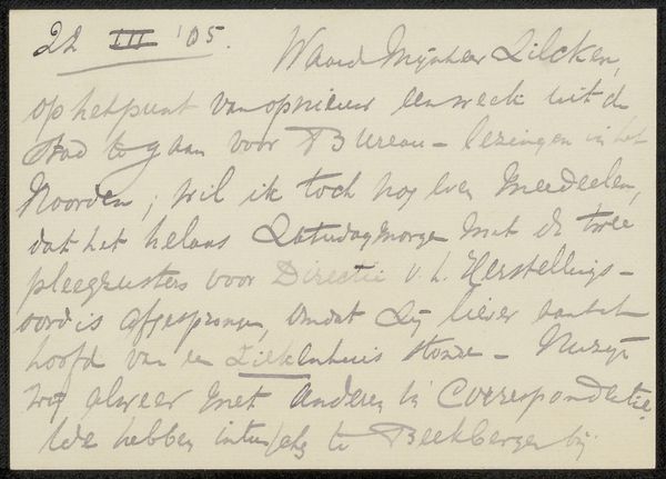
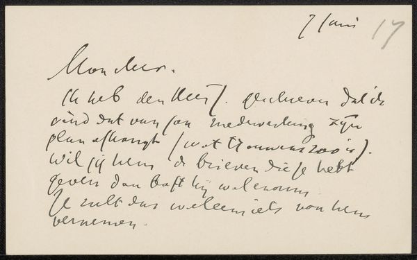
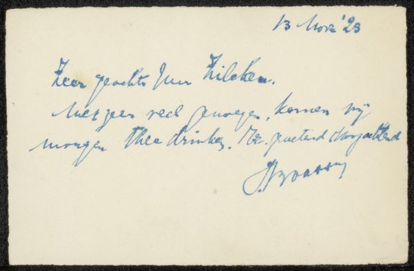
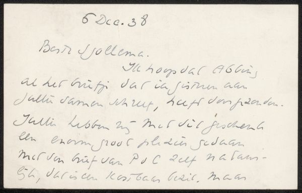
This is a calling card by Barbara Elisabeth van Houten, and it's all about the gesture, the movement of the hand. It's not about perfection, it's about the flow. See how the ink pools in some spots, where the pen lingered a little too long? It’s like she's pressing into the moment, feeling the words as she writes them. And the way the letters curve and loop, it's almost like a dance. The whole thing has a kind of off-the-cuff immediacy that feels really intimate. The surface is simple, like a painter's canvas. It reminds me a bit of Cy Twombly, in the way that it elevates the casual scribble to something profound. It’s a reminder that art isn't always about polished perfection; sometimes it’s about capturing the messy, beautiful, imperfect reality of being human.
Comments
No comments
Be the first to comment and join the conversation on the ultimate creative platform.
