drawing, textile, paper, ink, pen
#
drawing
#
hand-lettering
#
ink paper printed
#
hand drawn type
#
hand lettering
#
textile
#
paper
#
personal sketchbook
#
ink
#
hand-drawn typeface
#
ink colored
#
sketchbook drawing
#
pen
#
watercolour illustration
#
sketchbook art
Copyright: Rijks Museum: Open Domain
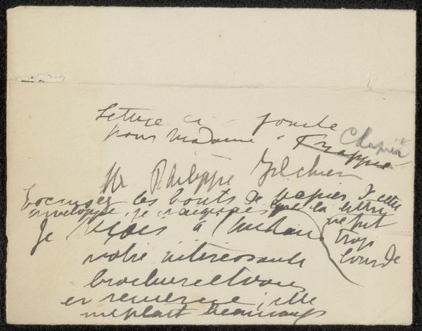
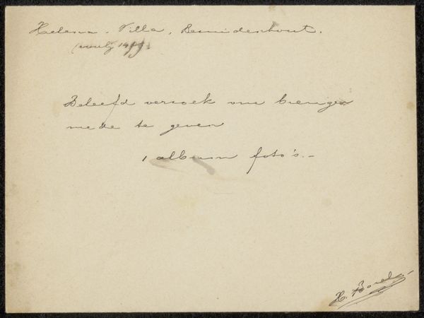
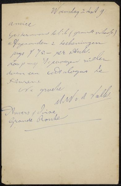
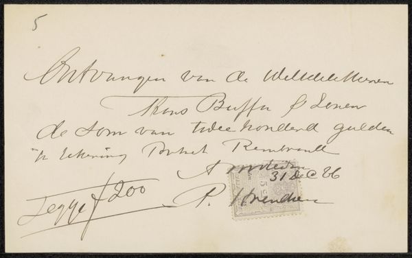
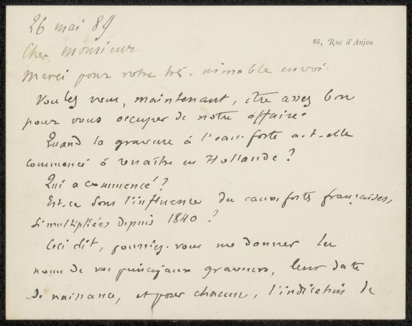
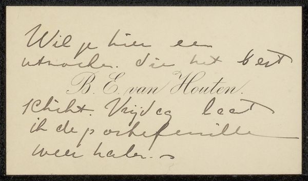
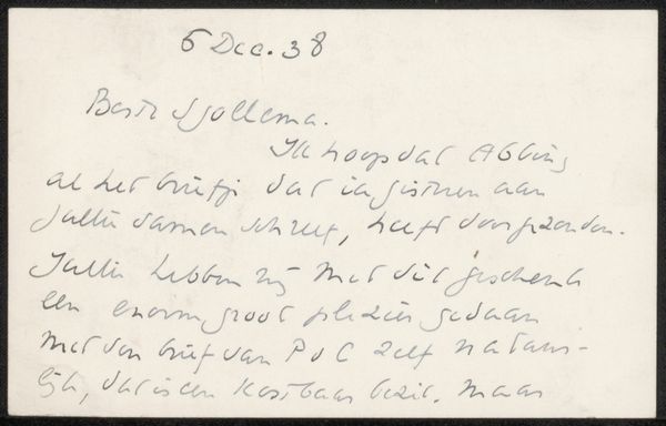
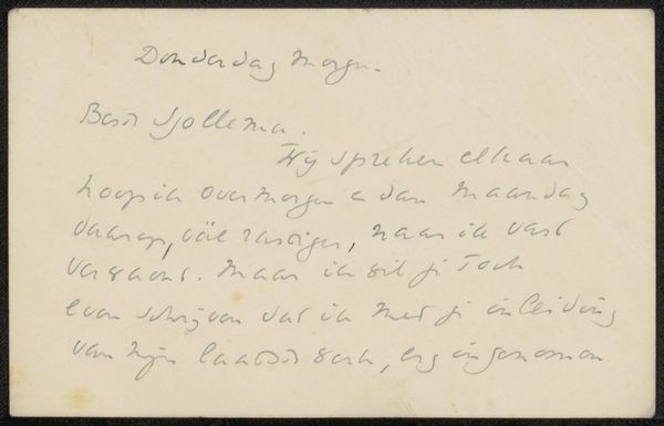
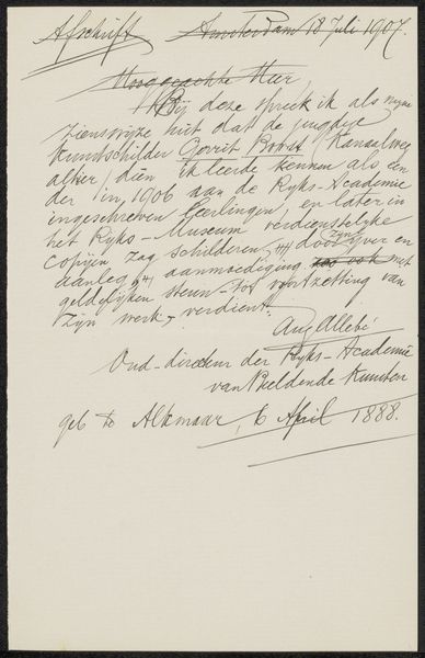
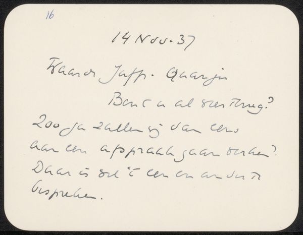
Editor: Here we have Selma Boasson’s “Brief aan Philip Zilcken,” possibly from 1923. It’s a drawing done with pen and ink on paper. The handwriting feels almost like a textile pattern. What jumps out at you about this piece? Curator: For me, it’s the materiality of the letter itself. The ink, the paper, the very act of handwriting – these were the means of communication before mass digital media. Consider the labour invested: the time taken to formulate thoughts, the physical effort of writing. Each stroke represents a conscious decision. Editor: That’s a good point, I didn’t consider the time factor! Curator: Think about the social context too. This letter wasn’t dashed off in an email; it required deliberate action – writing, perhaps a trip to a postbox. These physical limitations shaped the nature of communication itself, creating value, so would this be ‘art’ now if it had been digitally printed, or emailed, or simply erased? It's intriguing how this everyday artifact becomes something precious. It’s also nice to know the typeface would be custom. It's completely impractical from a print-making perspective. It suggests this note comes with an intention only to communicate and with no consideration about distribution, value, market, sales, which takes on an additional 'materialist' perspective. Editor: So, the letter's value resides not just in its content, but in the materials and labor that went into making it? Curator: Exactly! The hand-drawn quality contrasts with the clean, printed text we’re used to seeing, inviting us to consider how the means of production shapes our perception. In effect it resists the industrial reproduction standards! Editor: I guess I never really thought about how the choice of materials can be such an integral part of an artwork’s message. Thanks! Curator: It's about understanding that the “how” is just as important as the "what”. The creation and the intent, the hand versus the machine and understanding how and why certain paths are chosen. That the artist has elected to write with their own hand suggests the meaning is contained not only in the words themselves but the craft of communication!
Comments
No comments
Be the first to comment and join the conversation on the ultimate creative platform.
More like this