drawing, print, ink, engraving
#
drawing
#
baroque
# print
#
landscape
#
perspective
#
ink
#
cityscape
#
engraving
Dimensions: height 167 mm, width 201 mm
Copyright: Rijks Museum: Open Domain
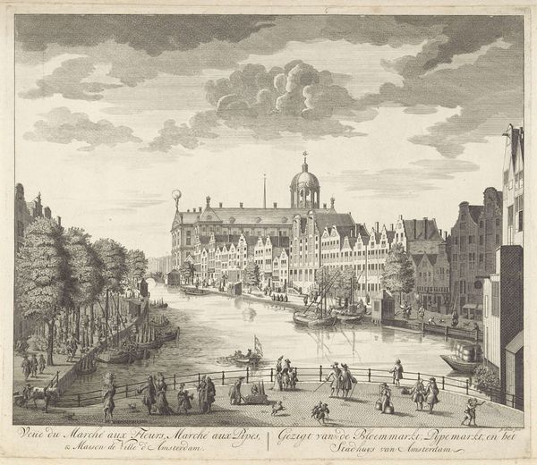
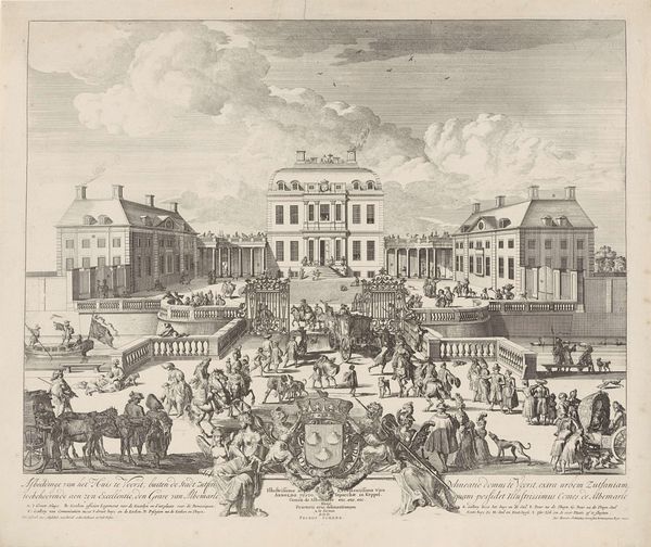
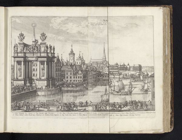
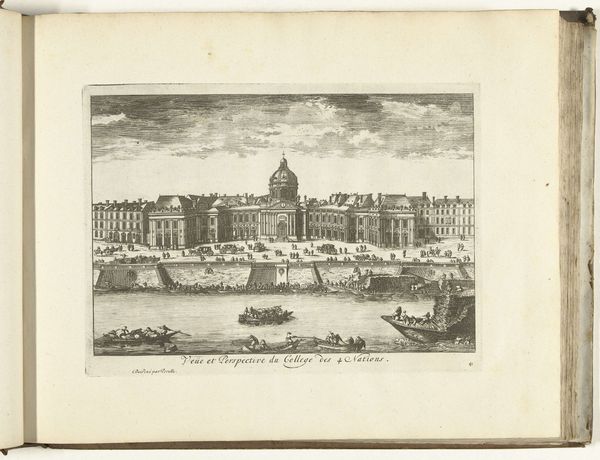
Curator: Before us is an engraving entitled "Gezicht op Collège des Quatre-Nations, te Parijs," which translates to "View of the Collège des Quatre-Nations in Paris." Though unsigned, it's estimated to have been created between 1675 and 1711. The work is currently held at the Rijksmuseum. Editor: The stark contrasts in the lines create a feeling of intense formality—almost austere. The image feels rigidly controlled, like a blueprint or an official record. Curator: The work presents a precise perspectival rendering. Note how the architectural details of the Collège are meticulously delineated, emphasizing its imposing structure and symmetrical design. The artist expertly used line and shadow to suggest depth, inviting the viewer to contemplate the relationship between space and power. Editor: Yes, but that rigidness, I think, underscores the social stratification of the time. See how the Collège, meant for elite education, is prominently displayed, while the figures along the river, engaged in what looks like manual labor, are miniaturized, almost faceless? The print subtly normalizes a social hierarchy, doesn’t it? The building looms, literally overshadowing them. Curator: One could argue that such readings are imposing a modern lens onto a work concerned primarily with aesthetic principles. Consider the balanced composition. The horizontal emphasis of the river is interrupted only by the rising verticals of the buildings. This balance reflects classical ideals of harmony and order that permeated the Baroque period. Editor: But that "order" isn't neutral; it reflects the priorities and biases of the society that commissioned and consumed these images. Who were the intended viewers? What message about French power and progress was this image intended to communicate, and to whom? Understanding its function as propaganda allows us to deconstruct its seemingly objective aesthetic value. The focus on precise line work seems to be another demonstration of power, of control, of being in charge of defining and shaping how the world is seen. Curator: It's fascinating how we can perceive such different qualities within the same framework. The rigorous composition I appreciate, you interpret as a method for perpetuating social narratives. Editor: Absolutely, and questioning those assumed visual power dynamics invites us to ask critical questions. The contrast in textures too becomes another clue. How the rigid straight lines that create the buildings relate to the loose and curvy river below and the soft wisps of clouds that float above. All combine for an expression of class tension, and one can learn more through seeing that in visual form.
Comments
No comments
Be the first to comment and join the conversation on the ultimate creative platform.
More like this