print, engraving
#
portrait
#
facial expression drawing
#
baroque
# print
#
caricature
#
portrait reference
#
pencil drawing
#
portrait drawing
#
history-painting
#
engraving
#
portrait art
Dimensions: height 505 mm, width 272 mm
Copyright: Rijks Museum: Open Domain
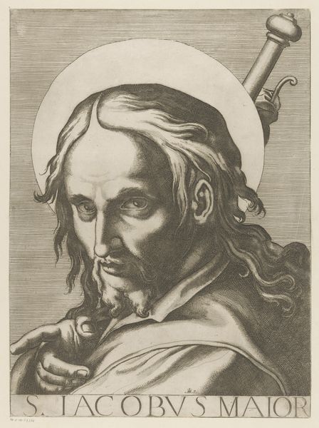
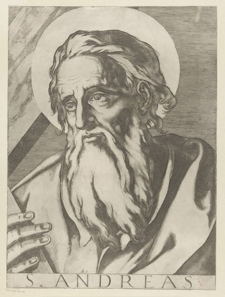
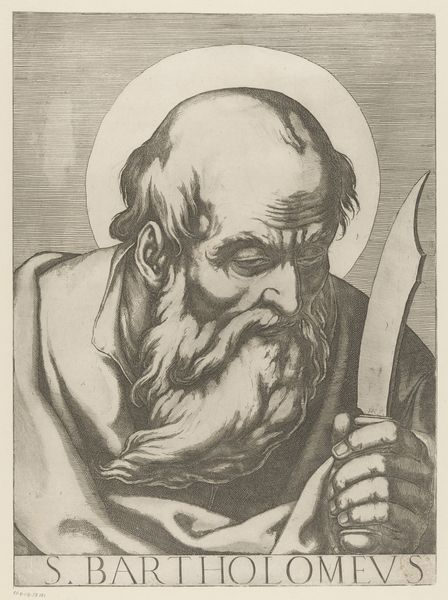
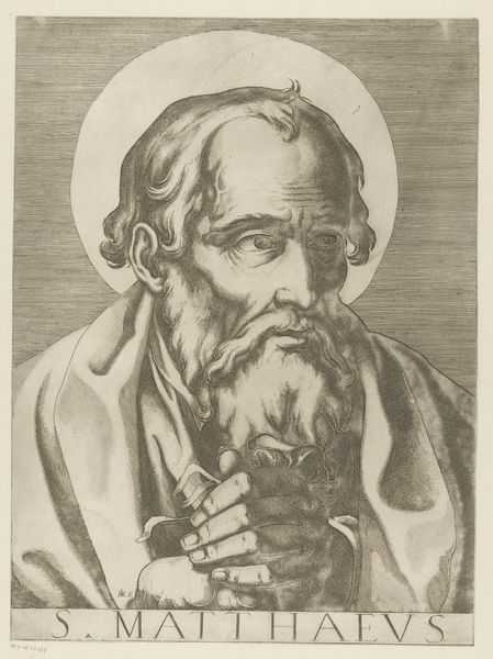
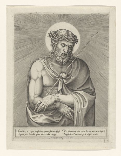
Editor: This is "Heilige Mattias" created between 1606 and 1607 by Raffaello Schiaminossi, a print now held at the Rijksmuseum. It's rendered in engraving and depicts the saint holding what looks like a halberd. I find the composition quite striking, particularly the way the face is etched with so much character using such fine lines. How do you interpret the piece? Curator: Let us focus on the structure of the composition itself. Note the contrast created by the light falling on the face, halo, and the subject's right hand against the comparatively darker shading in the robes. This interplay directs the eye immediately. Furthermore, examine how the lines function—the controlled, almost academic cross-hatching used to render shadow versus the single-line rendering used on the face. What does that signify for you? Editor: I see how the different lines emphasize different textures, creating more depth and distinction between forms and highlighting his age. What else do you notice? Curator: I'm drawn to the compositional choices. The placement of the halberd diagonally behind Mattias acts as both a visual counterweight to the figure and as a symbol of the Saint's martyrdom, according to Catholic tradition. Ask yourself, how does its geometric severity affect our perception of Mattias' face and, therefore, his persona as conceived by Schiaminossi? Does it feel balanced, or unbalanced? Editor: I'm not sure balanced is the word; the sharp angles of the weapon feel like they accentuate the softer, more human qualities of Mattias, as if the Saint is at odds with what's expected of him. Curator: Precisely! By focusing on these structural choices, Schiaminossi transcends the portrait itself. A surface appearance or, in semiotic terms, *signifier* hints at Mattias' *signified* complexity of character. I find the use of visual language fascinating. Editor: Absolutely, and I now recognize the sophistication within its formal arrangement. I appreciate a fresh outlook to grasp the power within this piece!
Comments
No comments
Be the first to comment and join the conversation on the ultimate creative platform.
