Copyright: Rijks Museum: Open Domain
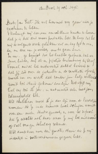
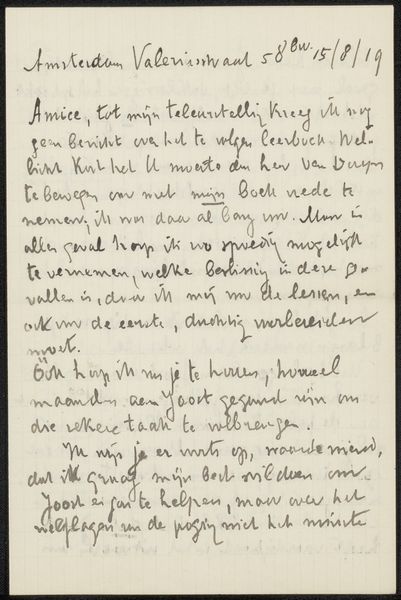
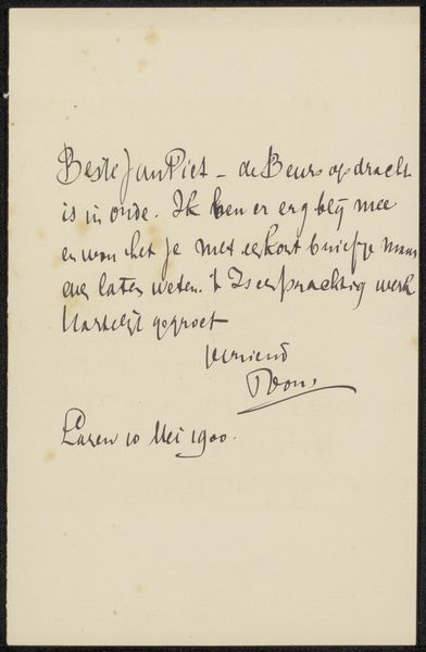
This is Jozef Israëls’ undated ‘Brief aan Philip Zilcken,’ held at the Rijksmuseum. At first glance, we see dark grey handwriting filling the cream-colored paper, which appears to be the kind used for personal correspondence. The handwriting is a strong, flowing cursive, almost like an abstract design, where the meaning is secondary to the gesture of writing. In this regard, the artwork can be seen as a semiotic representation. The signs—the written words—create a system of meaning only accessible to those who understand the Dutch language. However, the visual components of the text—its curves, strokes, and overall composition—can be appreciated aesthetically, even without understanding the textual content. Israëls uses the form of a letter to engage with ideas about communication and intention, and the structure of the letter mirrors the structure of human thought and connection. Ultimately, what remains with the viewer is the visual texture and the deliberate, artistic arrangement of language, inviting continuous reflection on the relationship between form and content.
Comments
No comments
Be the first to comment and join the conversation on the ultimate creative platform.
More like this